Proteus Motion: Insights and Recommendations
Role: Product Designer, UI/UX
For: Android App & Web
Tool: Figma
Role: Product Designer, UI/UX
For: Android App & Web
Tool: Figma
Proteus® is a revolutionary performance testing device combined with a powerful new resistance training tool. Proteus’ patented 3D Resistance and Software Insights unlocks the first and only way to measure strength and power for every human movement, so Proteus can deliver the most personalized training insights in history.
︎︎︎Learn More About Proteus
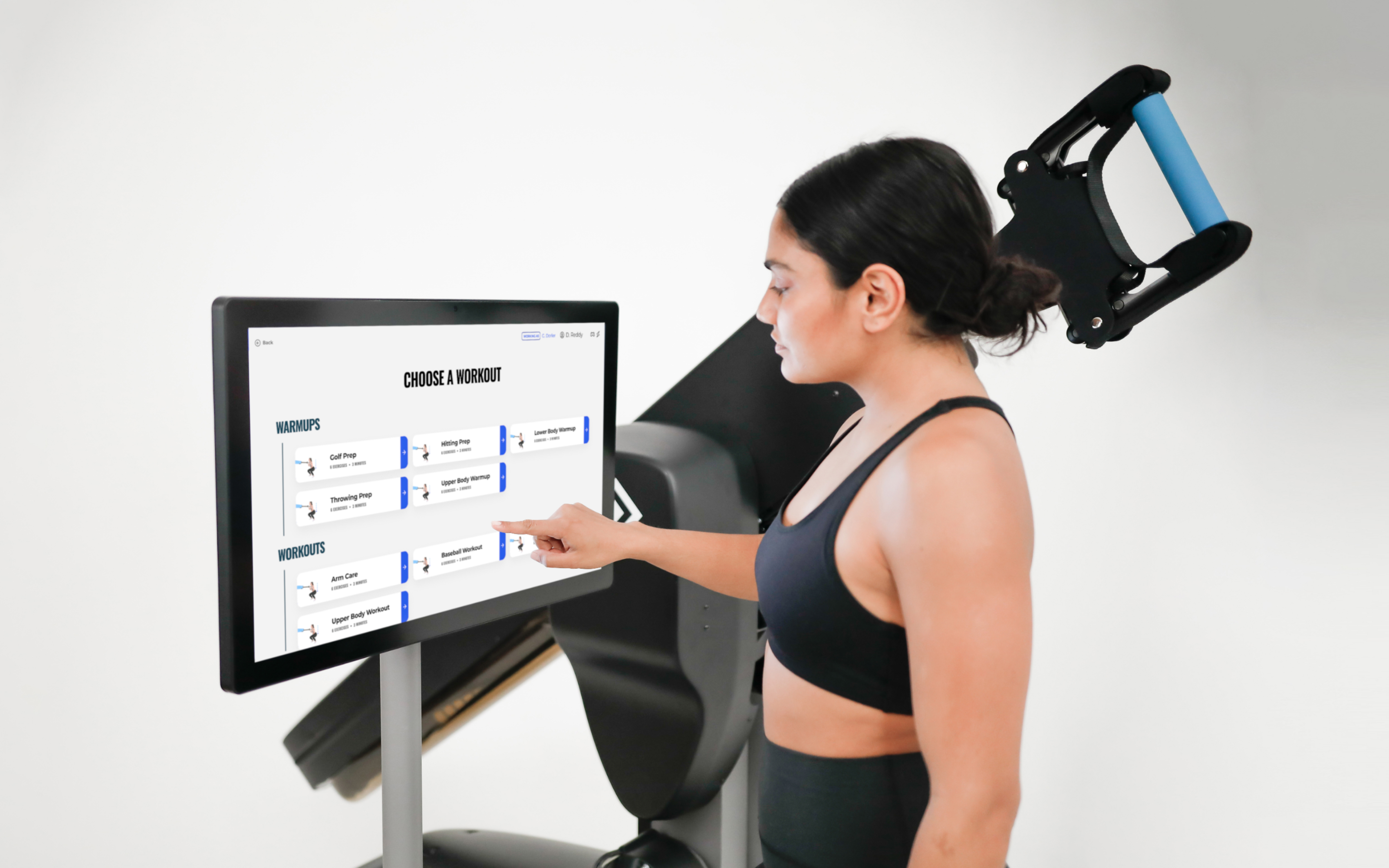
Proteus software guides users through 4-minute physical assessments, arming trainers with unprecended performance data and insights and creating an entirely new standard for personal fitness and physical rehabilitation.
While working at Proteus I was part of an ambitious project to create a new Insights and Recommendations feature. The feature gives users the power to:
︎︎︎Insights and Recommendations Explainer
︎︎︎Learn More About Proteus
Proteus software guides users through 4-minute physical assessments, arming trainers with unprecended performance data and insights and creating an entirely new standard for personal fitness and physical rehabilitation.
While working at Proteus I was part of an ambitious project to create a new Insights and Recommendations feature. The feature gives users the power to:
- Track their personal progress across Proteus Power-based tests
- Compare themselves against the norm for their age, sex, and sport
- Understand which body areas need the most attention
- Get training recommendations for every movement category
- Share their results to a personal device for on-the-go training
︎︎︎Insights and Recommendations Explainer


The Problem
Many athletes and trainers do not yet have the expertise to interpret and take the next best actions informed by the results of a Proteus Power-based test. These users also do not have a straightforward way to track their progress between tests, using awkward workarounds to compare two reports.


Previously, Proteus generated only a Power Report (right) to display a user’s results after completing a Power-based test (left). Power reports alone are not able to track user progress between different tests and do not provide recommendations for how a user might improve their performance in their problem areas.
The Challenge
Our goal for the project was to completely change the way our users personalize training by classifying the results of power-based tests and providing recommended exercises to help them to improve their future scores and athletic performance.
Simply put, a user may have a core that needs to train speed or legs that need to train strength, and Proteus will tell you this.
In more technical terms, users will have the option to compare their test results against other Proteus users in their cohort— determined by their age, sex, height, weight, sport, position, and skill level— or compare themselves against an aspirational cohort. For example, a baseball player on a high school team wants to compare himself against college-level players to increse his chances of recieving a sports scholarship.
The classifications are based on the percentile rankings of the power and acceleration scores for each movement category and will vary according to the filters set. Each movement category will be put into 1 of 4 classifications: Low Strength, Speed Dominant, Strength Dominant, or High Strength and Speed.
High-Level Goals
For the Business
For Trainers
For Athletes
- Drive increased usage of testing mode
- Increase client satisfaction with diagnostic testing mode
- Reinforce the fact that this powerful information is exclusively available on Proteus
For Trainers
- Give trainers topline understanding of their client’s testing results
- Supply trainers with recommendations that they can leverage to adapt and build training programs for their clients
- Engender greater trust in trainers by their athlete clients
- Facilitate tracking progression between testing sessions
For Athletes
- Give athletes topline understanding of their testing results
- Encourage athlete success in their fitness goals by showing progress made between tests
- Provide context to discuss their fitness goals with their trainers
- Facilitate tracking progression between testing sessions
My Role
I collaborated with Proteus’ Director of Product Design to design the new feature in 2022. We worked alongside the Director of Software Engineering, 3 Software Engineers, the Head of Human Performance and Sports Science, and Proteus’ CEO.
I participated in the process from start to finish, from creating early sketches and wireframes to designing pixel-perfect UI and participating in visual QA with the engineering team.
I participated in the process from start to finish, from creating early sketches and wireframes to designing pixel-perfect UI and participating in visual QA with the engineering team.

(Above) In the first round of wireframing we produced two possible directions for the new feature
Understanding Our Users’ Needs
Conducting User Interviews
Conducting User Interviews
Based on the project goals and requirements we created a first round of wireframes, which included two different approaches for how we might organize the data and information. Direction A was built around an existing navigation menu on the left side of the screen and presented all of the information in one long scroll. The second direction reimagined the navigation by replacing it with tabs at the top of the screen, providing users with different views for their overall test results and insights and recommendations.
We wanted to understand if and how this feature could provide the most value to our users so we conducted interviews with 5 trainers who actively use Proteus. We presented both directions to the trainers and gathered their first reactions and feedback. The Director of Product Design and I collaborated on the interview script. I took notes in Figjam during 4/5 interviews and I lead one of the interviews myself.
We wanted to understand if and how this feature could provide the most value to our users so we conducted interviews with 5 trainers who actively use Proteus. We presented both directions to the trainers and gathered their first reactions and feedback. The Director of Product Design and I collaborated on the interview script. I took notes in Figjam during 4/5 interviews and I lead one of the interviews myself.

(Above) A consolidated board of feedback and reactions to the first round of wireframes, expressed by 5 different trainers who actively use Proteus
Responding to User Feedback
Refining Wireframes
Refining Wireframes
The trainers interviewed showed a clear preference for Direction B’s layout and navigation, noting that it was very easy to scan for information. However, most trainers also found the clear trendlines and muscle diagrams proposed in Direction A to be of great value. We developed a final set of wireframes that combined the two directions according to these findings.
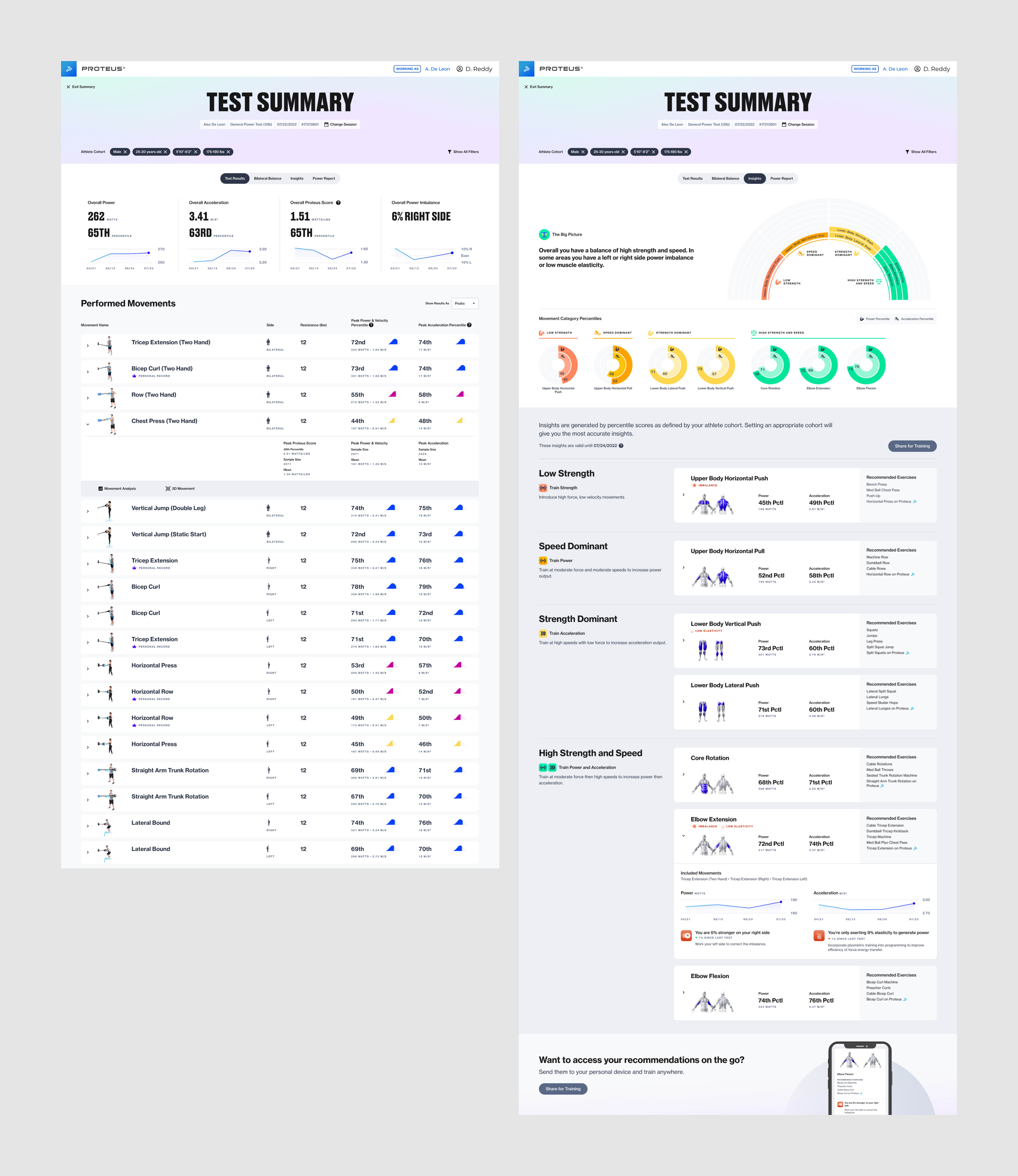
The Test Results tab delivers a topline overview of Average Power, Acceleration, Proteus Score, and Power Imbalance trends across all of the user’s tests. It lists the movements performed and percentile scores for each movement in a table below.
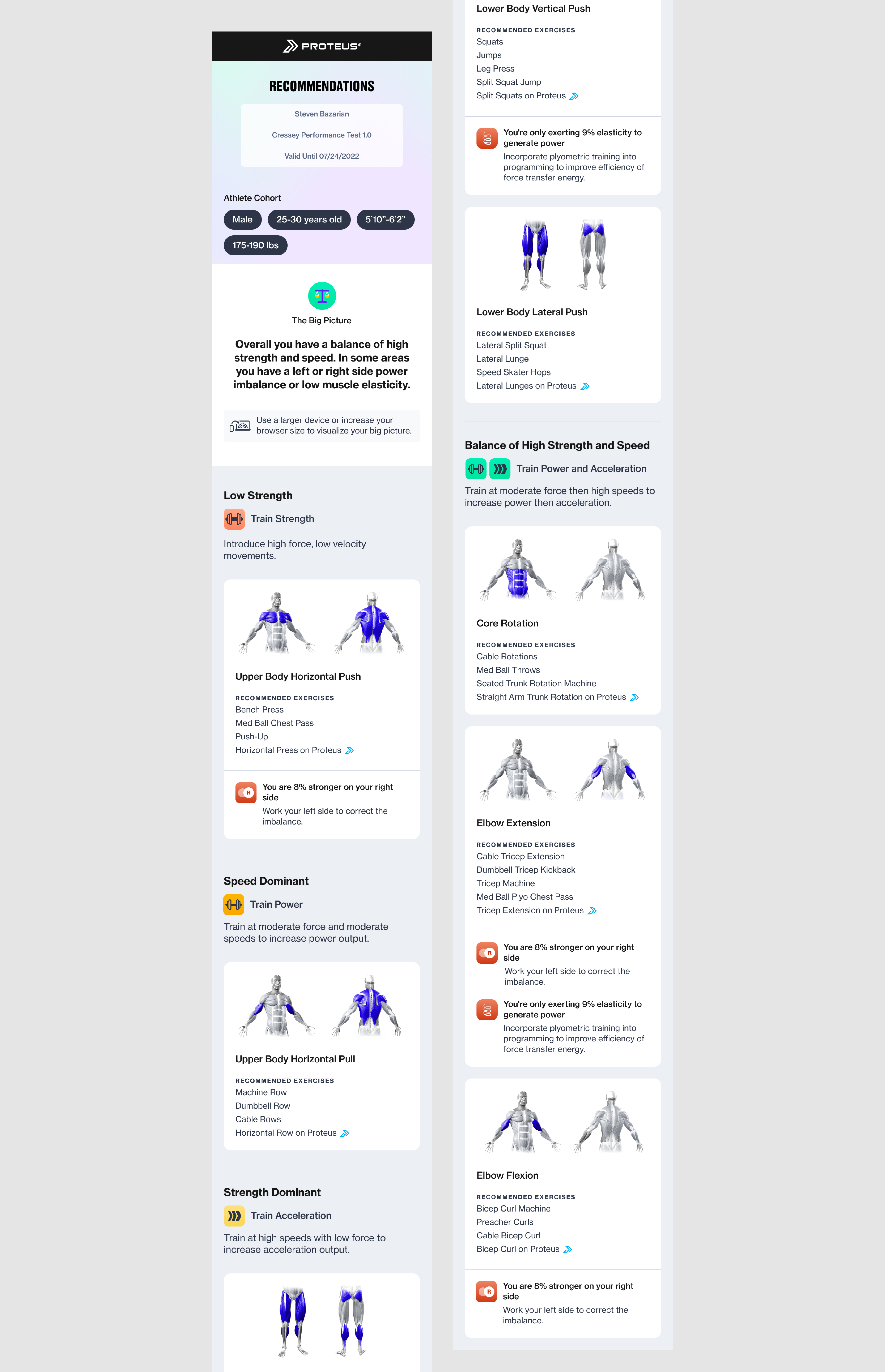
The Recommendations tab displays each movement category in its respective classification, explaining the meaning of the classifications and providing recommended exercises that can be performed on or off Proteus. Each movement category card can be expanded to display progress tracking for up to 4 recent tests, as well as plyometric or side imbalance data when applicable.
The Shared Recommendations is a web page that can be shared to a user’s personal device from the Proteus kiosk. It gives a consolidated overview of the user’s classifications and recommended exercises for use off Proteus or on-the-go.
The Test Results tab delivers a topline overview of Average Power, Acceleration, Proteus Score, and Power Imbalance trends across all of the user’s tests. It lists the movements performed and percentile scores for each movement in a table below.
The Recommendations tab displays each movement category in its respective classification, explaining the meaning of the classifications and providing recommended exercises that can be performed on or off Proteus. Each movement category card can be expanded to display progress tracking for up to 4 recent tests, as well as plyometric or side imbalance data when applicable.
The Shared Recommendations is a web page that can be shared to a user’s personal device from the Proteus kiosk. It gives a consolidated overview of the user’s classifications and recommended exercises for use off Proteus or on-the-go.

(Above) Refined wireframes for Test Results and Recommendations based on our findings from the trainer interviews


(Above) The pre-existing Bilateral Balance view and Power Report were incorporated into this feature but they did not undergo a full redesign at this time.
Working Backwards from Perfect
Crafting the Insights Visualization
Crafting the Insights Visualization
Before we could jump into the visual design phase, it was important to ensure that the data visualizations we display at the top of the feature will properly aid the user in their understanding of their insights and recommendations. After much team discussion and many rounds of iterating, we decided to add a new visualization to the top of the Insights view.
We came up with a unique visualization reminiscent of a fan chart that displays each movement category in its classification. The chart is color coded to further signal where users should aspire to be— red indicates a balance of low scores in both Power and Acceleration and green indicates a balance of high scores. Orange and Yellow indicate an imbalance between scores.
We designed a second visualization in the form of donut charts that displays the user’s Power and Acceleration percentile numbers, providing a quick glance at the data that dermined the classifications.
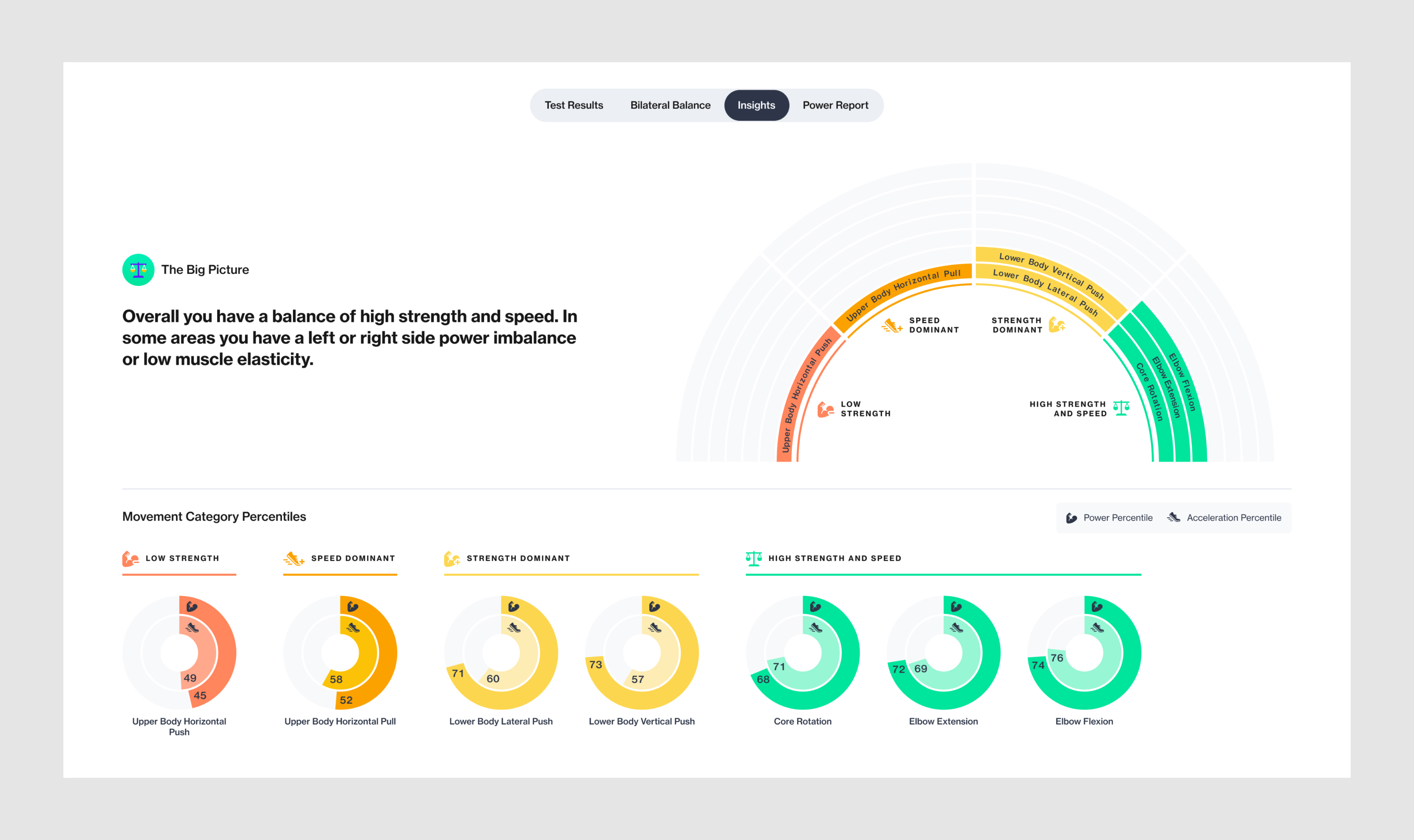
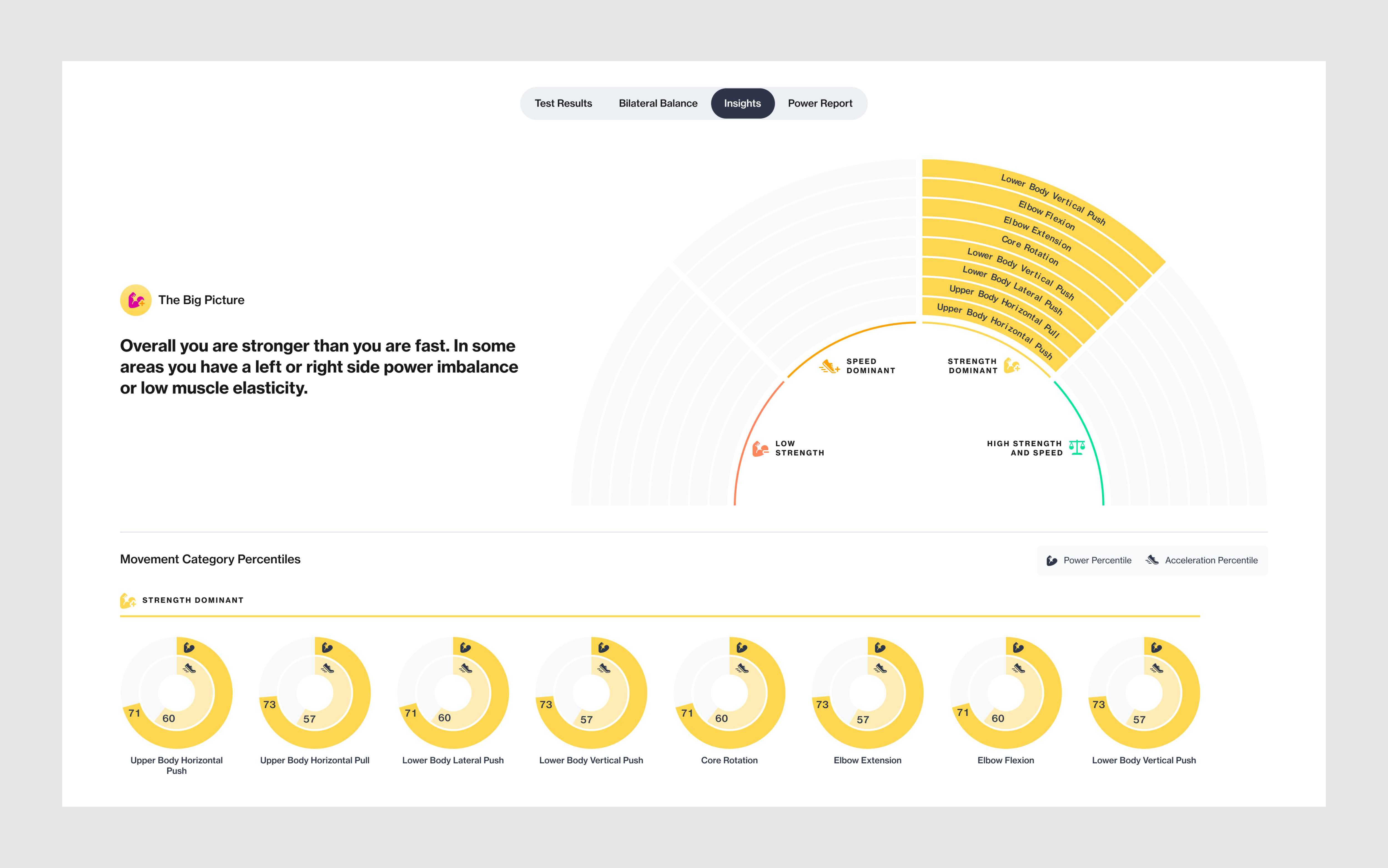

(Above) Three different permuatations of the Insights visualization showing 1. A user with movement categories falling in mixed classifications, 2. A user with all movement categories falling in the same classification, and 3. Results of a test with a smaller number of performed movements.
Visual Design
Designing Pixel-Perfect UI
Designing Pixel-Perfect UI
Working from Proteus’ evolving design system, we created visual designs from our wireframes. Proteus’ Director of Product Design defined the baseline of the new design system and it is constantly evolving as existing features are redesigned and new features are added to the software.
(Above) Final visual designs for the Test Results and Insights views. 1920x1080 kiosk size
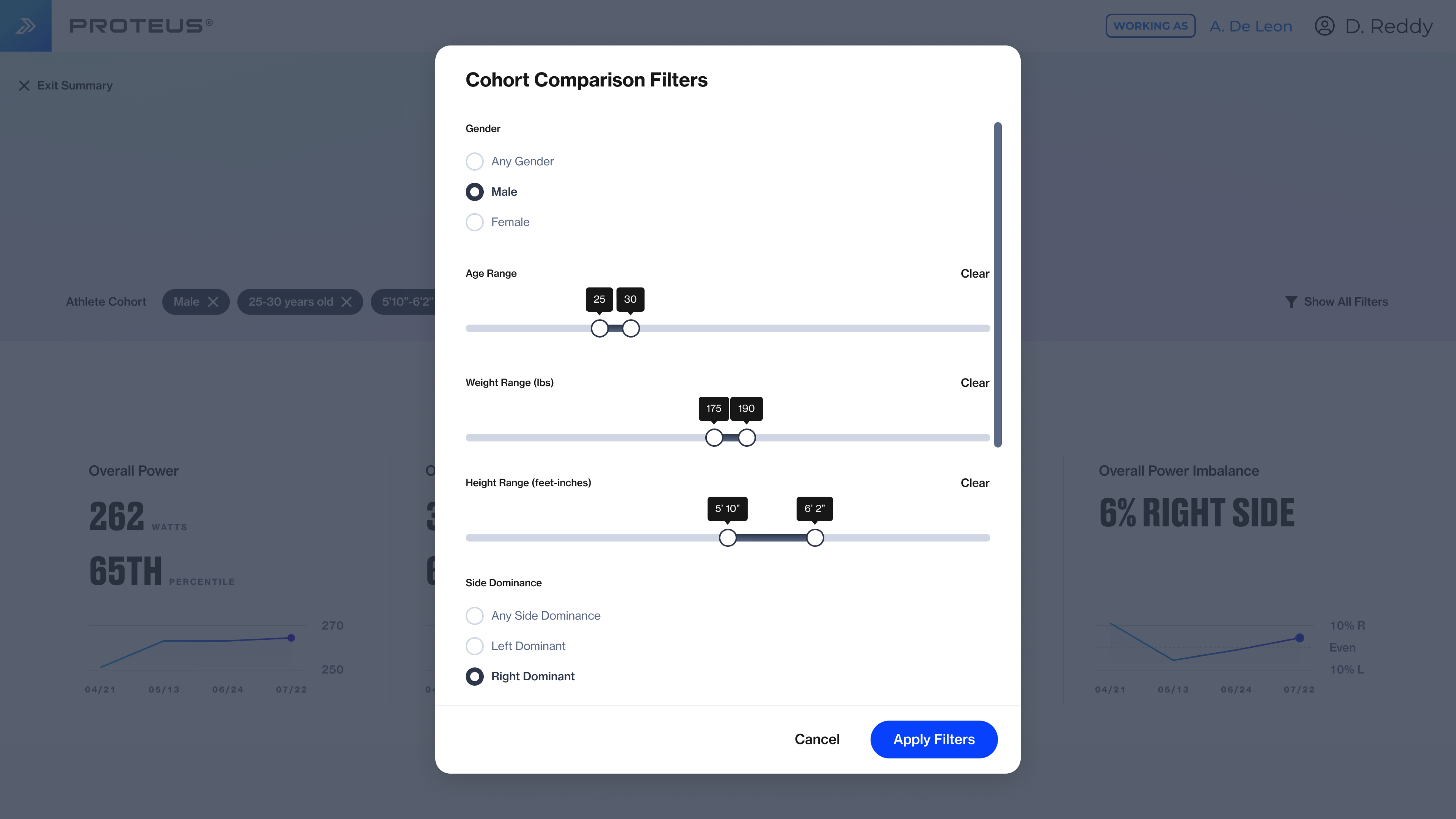

(Above) Filters modal and Test Selection modal. 1920x1080 kiosk size
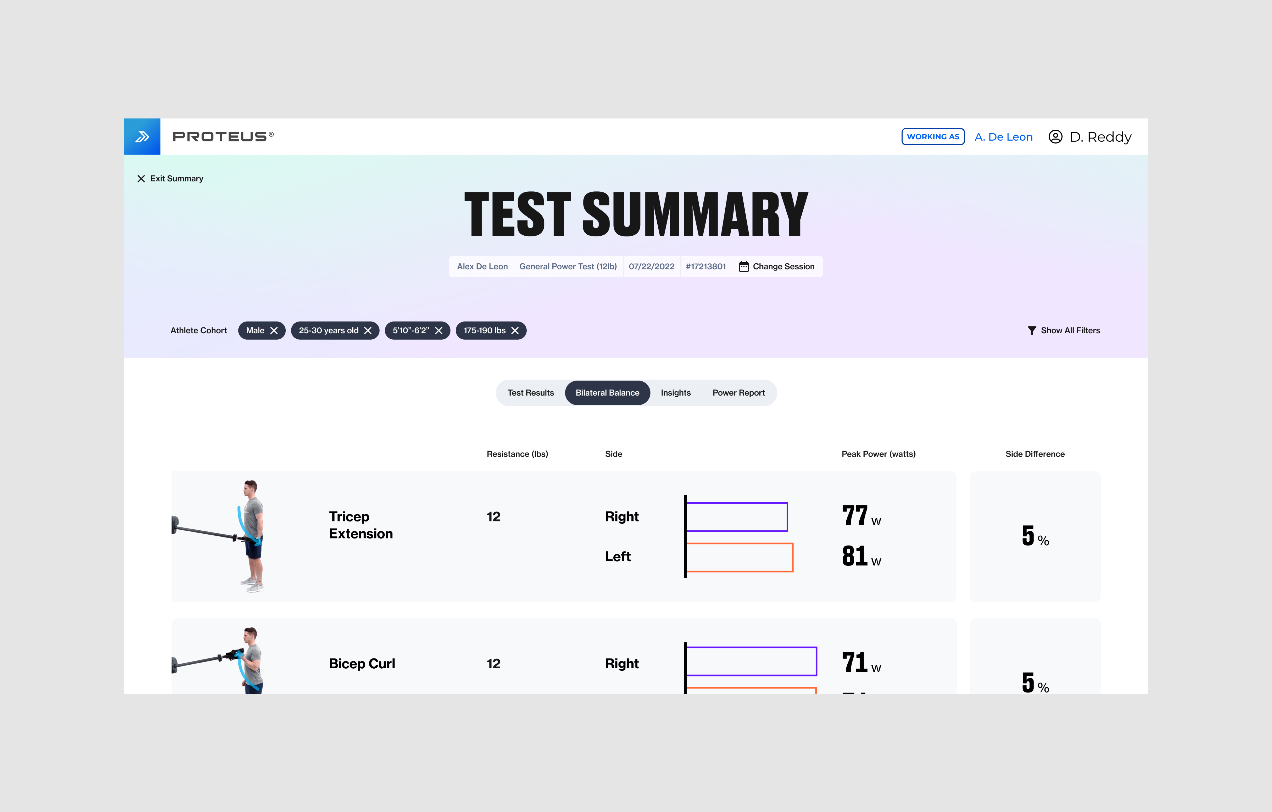
(Above) Final visual design for the Bilateral Balance view. This view recieved a simple reskin of fonts and colors but the UX did not change at this time.
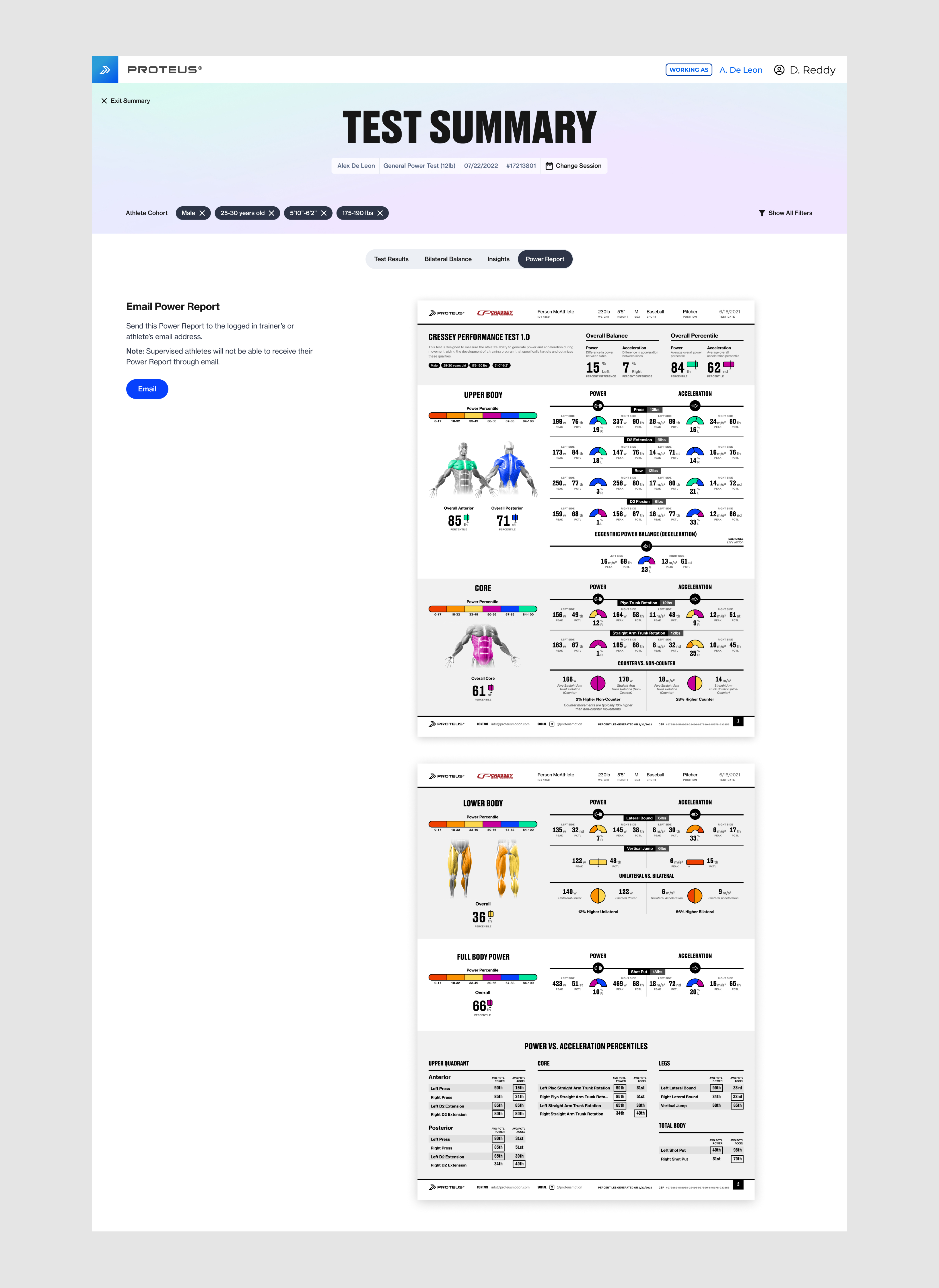
(Right) Final visual design for the Power Report view
1920x1080 kiosk size

(Above) A selection of edge case examples for the Insights view. 1920x1080 kiosk size
Responsive Web Design
Designing for Large and Medium Breakpoints
Designing for Large and Medium Breakpoints
Most Proteus units are installed in sports performance or rehabilitation facilites, therefore many users do not have access to its software features at home or on the go. We created responsive designs for desktop, laptop, and tablet sizes so users can view the Insights and Recommendations feature from their personal computers or tablets.

(Above) Responsive designs for the Insights view
Sharing Recommendations
Insights and Recommendations On-The-Go
Insights and Recommendations On-The-Go
While users can access Insights and Recommendations on their personal devices, the Shared Recommendations feature allows athletes to take home a condensed, straight-forward version for on-the-go training anywhere.
Shared Recommendations is a webpage that displays the cohort filters selected at the time the link was shared, classifications for each movement category and the corresponding recommended exercises, and plyometrics and side imbalance information when applicable.
Users can choose “Share for Training” from the Insights view on the Proteus kiosk, which will prompt them to either scan a QR code or send the link to their email address.

(Above) Recommendations can be shared from both the top and bottom of the Insights view

(Above) The sharing flow, from top to bottom. Illustrations designed by me.
(Above) Final visual designs for Shared Recommendations. 375px mobile size.
Responsive Designs
Designing for X-Small, Small, Medium, and Large Breakpoints
Designing for X-Small, Small, Medium, and Large Breakpoints
We optimized the Shared Recommendations design for mobile, as this is is the device most users will have with them on the go, but we designed it at 4 different breakpoints so it can be viewed efficiently on any personal device.

(Above) Responsive designs for Shared Recommendations at the XS, S, M, L breakpoints.

(Above) A selection of edge case examples for Shared Recommendations
Additional Project Credits
Will Gabrenya
Director of Product Design
Jason Shaev
Director of Software Engineering
Will Waterman
Head of Human Performance and Sports Science
Sam Miller
CEO of Proteus Motion
Director of Product Design
Jason Shaev
Director of Software Engineering
Will Waterman
Head of Human Performance and Sports Science
Sam Miller
CEO of Proteus Motion
Brendan Kelly
Senior Software Engineer
Andres Gonzalez
Software Engineer
Doug Moore
Software Engineer
Designed at Proteus Motion, 2022
Senior Software Engineer
Andres Gonzalez
Software Engineer
Doug Moore
Software Engineer
Designed at Proteus Motion, 2022