March of Dimes
Role: Visual Designer
For: Brand Identity & Marketing Assets
Tool: Adobe Illustrator, Adobe Indesign
March of Dimes leads the fight for the health of all moms and babies. They believe every baby deserves the best possible start, but unfortunately not all babies get one. They are working to change that.
︎︎︎Case study
︎︎︎Case study

For 80 years, March of Dimes helped millions of babies survive and thrive. It began with Franklin D. Roosevelt’s personal struggle with polio, which led to the birth of the organization and pioneering of the vaccine research that eradicated polio in the U.S. March of Dimes then shifted their focus to address some of the biggest health threats to moms and babies. From advocacy to education research, they are working to level the playing field to ensure all moms and babies are healthy, regardless of age, socio-economic background, or demographics.


The challenge: Despite a history of success, March of Dimes’ role in the fight for healthy babies was unclear. The issues are increasingly prominent, but like their peers, they were experiencing setbacks. While many organizations are building more impactful brands, March of Dimes was continuing to fade, with stakeholders finding the current focus on the NICU difficult to articulate, the legacy irrelevant, and the branding too soft.


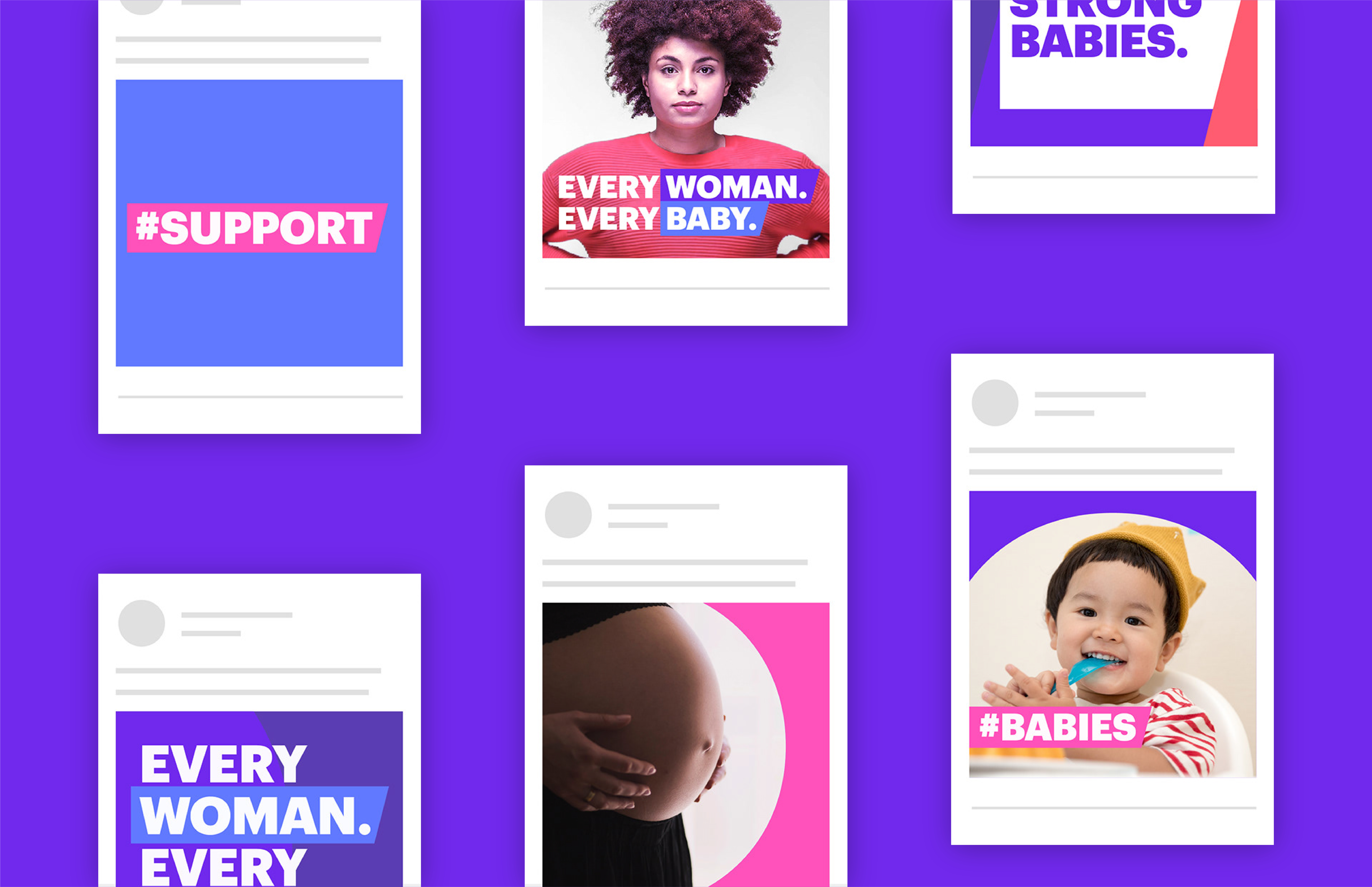
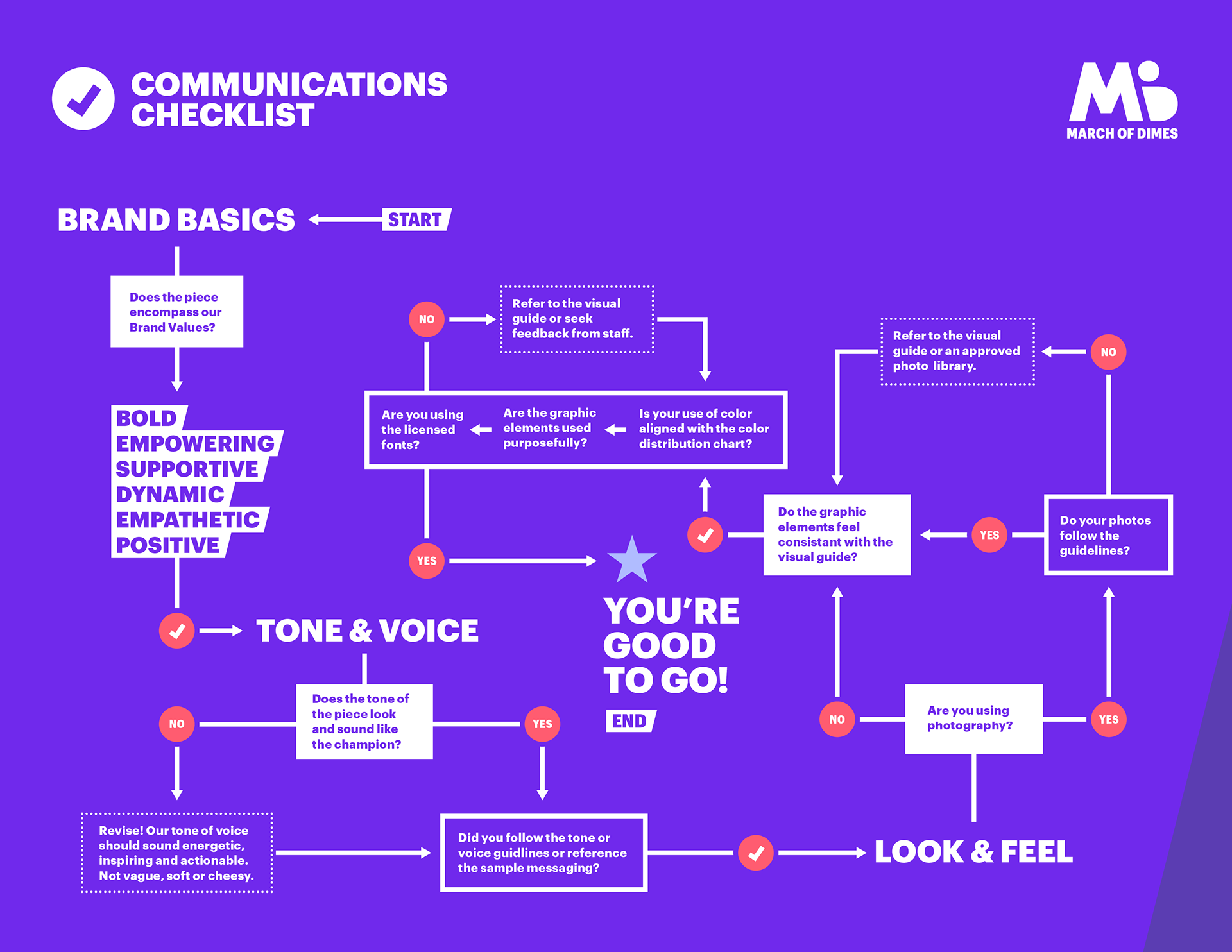
The new identity positions March of Dimes as champions of the needs of moms and babies, leading the fight to improve their health. Through the bold typography and colors and the bright, uplifting photography often featuring strong women, the identity repositions the organization to appear positive and empowering rather than soft and sad. It also maintains a sense of support and empathy when necessary through the use of a serif font, secure containing shapes, and intimate photos of families and their babies.


