Outcast
Print, Editorial, Digital
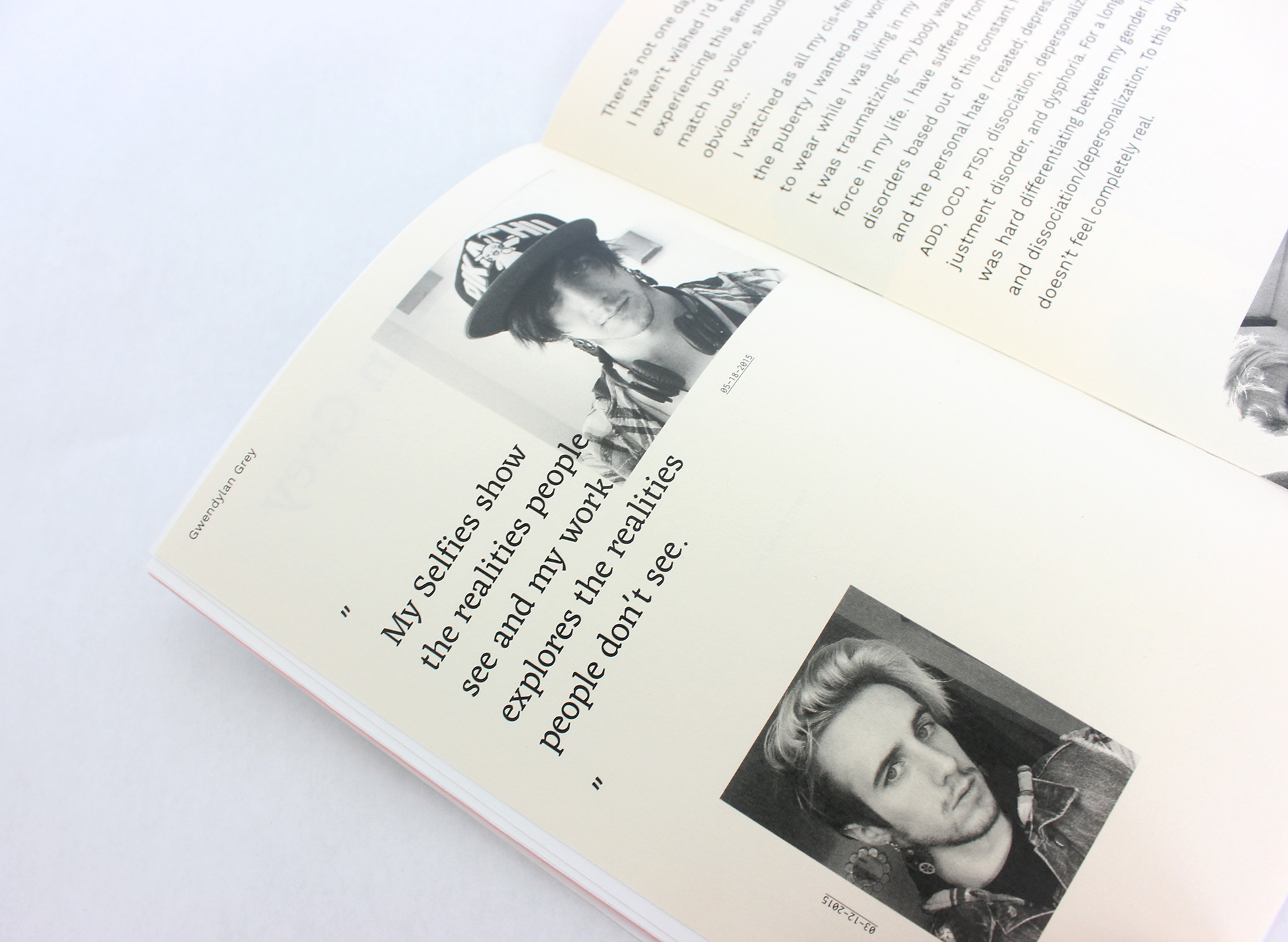
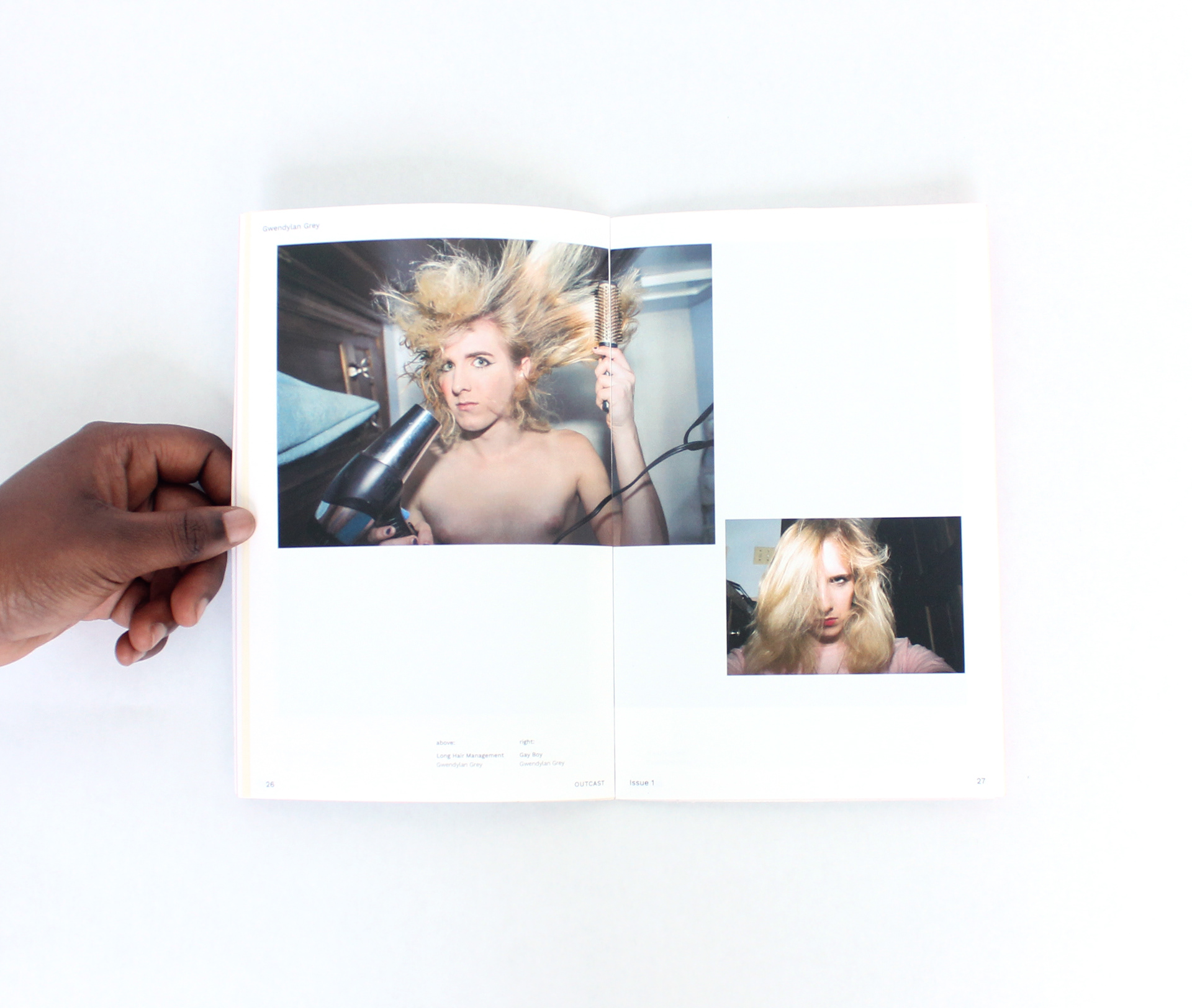
How can we take inspiration from zines and DIY design without replicating it? Outcast is a platform for sharing and celebrating queer ideas, identities, experiences, and art outside of the mainstream. It places a special focus on accessibility and challenges the idea that a publication has to be scrappy to be accessible.


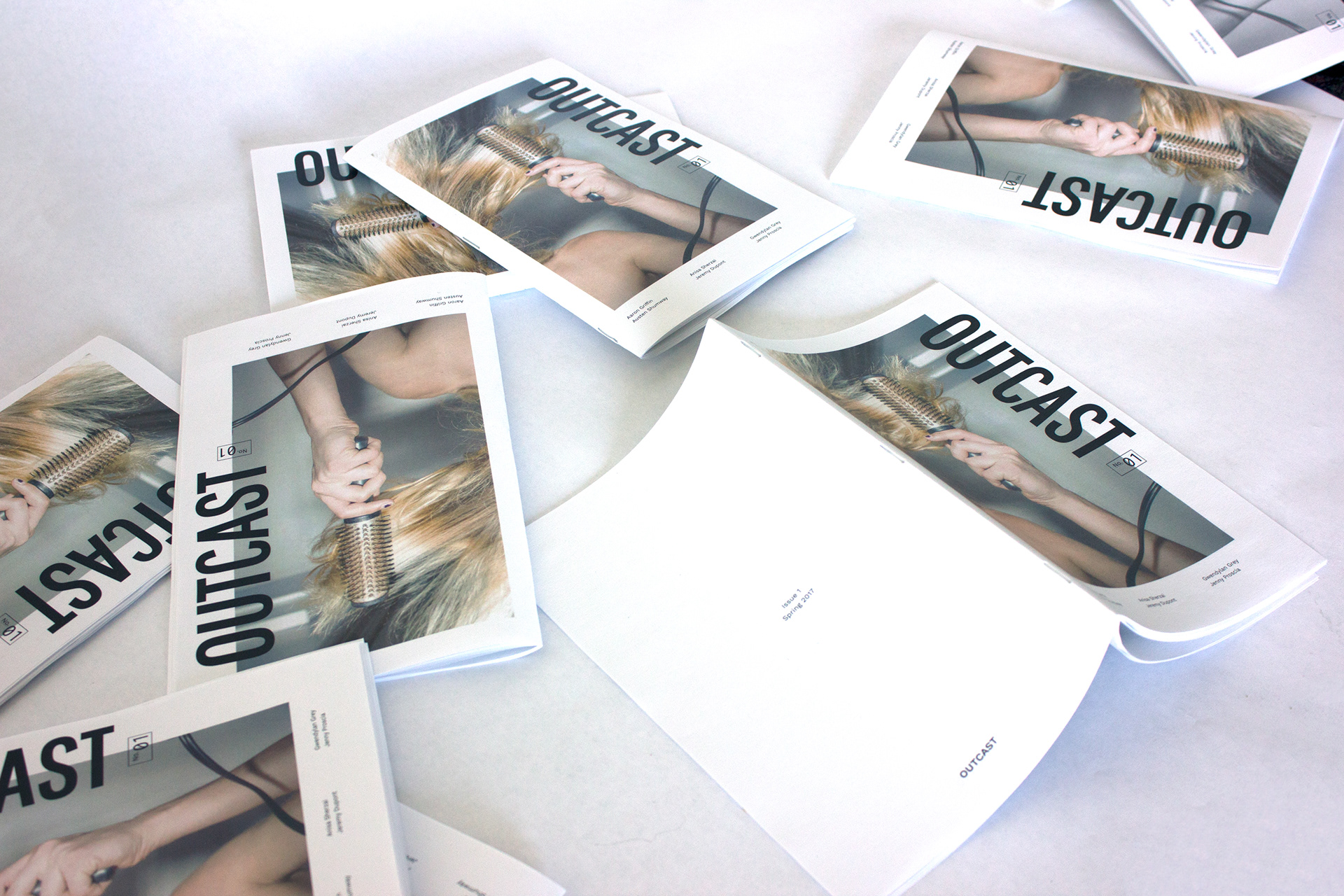
The publication focuses on a niche audience that doesn't have a solidified mainstream design voice and primarily utilizes submission-based content. It is designed so that it can exist in an "ideal" format, in which binding and paper stock are considered, but can also be re-created in DIY format.


The size of the publication is a folded letter size page and everything is designed within the margins, making it easy to print at home. It also utilizes open source fonts so it can be designed free of cost. Everything apart from the artwork is designed in black to avoid being altered based on the type of printer a reader may have access to.

To further aid in its accessibility, Outcast has a simple web component. It allows readers to read each issue online or print at home from a file set up in the correct booklet printing order. It also provides assembly instructions that explain the basics of putting the publication together, as well as suggestions for different paper stocks and binding options.

All work in Outcast remains unedited unless permission has been granted by the contributor.
Degree Project 2017, All design work by Steven Bazarian
Degree Project 2017, All design work by Steven Bazarian