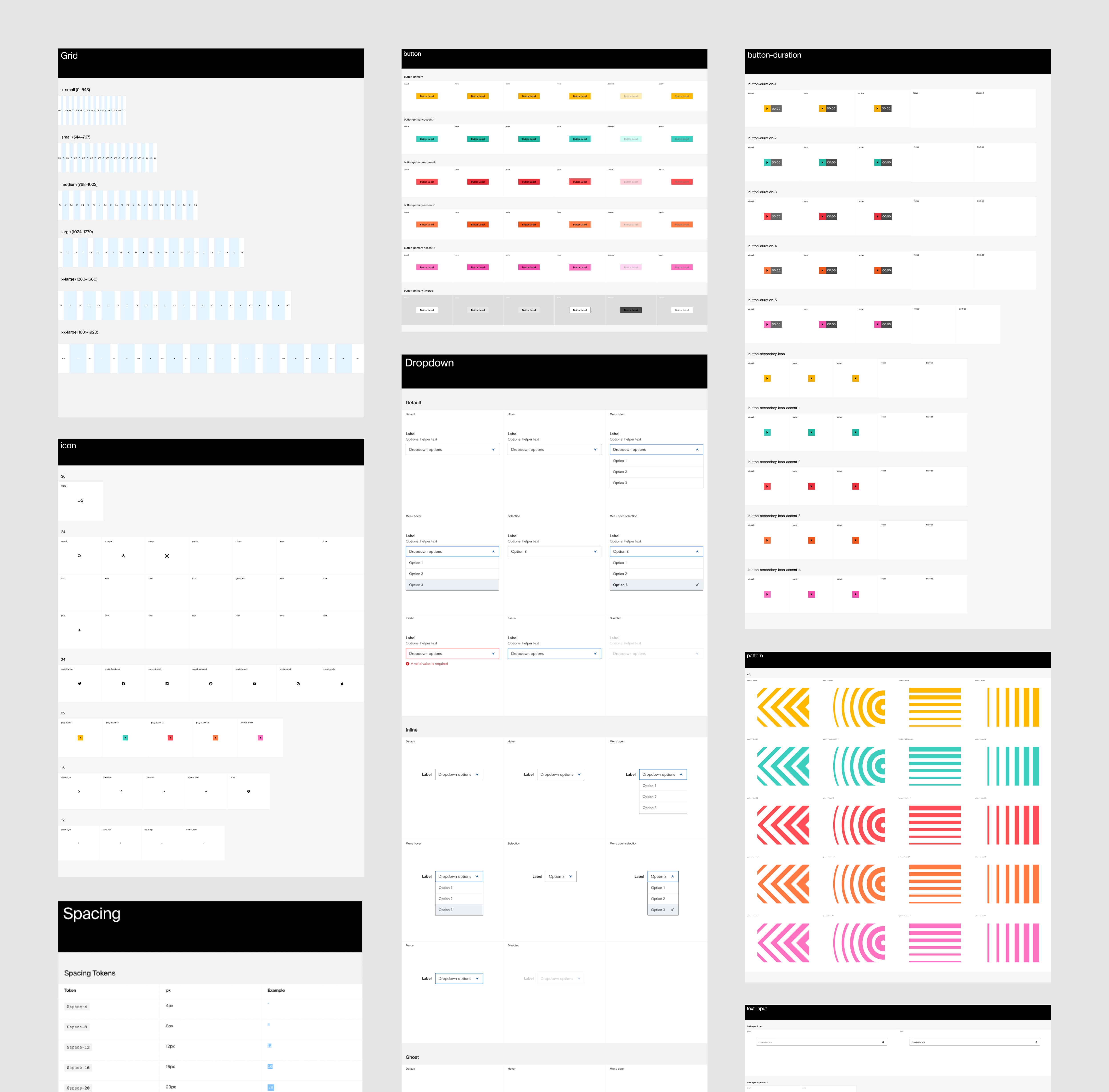
Proteus Motion: Insights and Recommendations
Role: Product Designer, UI/UX
For: Android App & Web
Tool: Figma
Role: Product Designer, UI/UX
For: Android App & Web
Tool: Figma
Proteus® is a revolutionary performance testing device combined with a powerful new resistance training tool. Proteus’ patented 3D Resistance and Software Insights unlocks the first and only way to measure strength and power for every human movement, so Proteus can deliver the most personalized training insights in history.
︎︎︎Learn More About Proteus
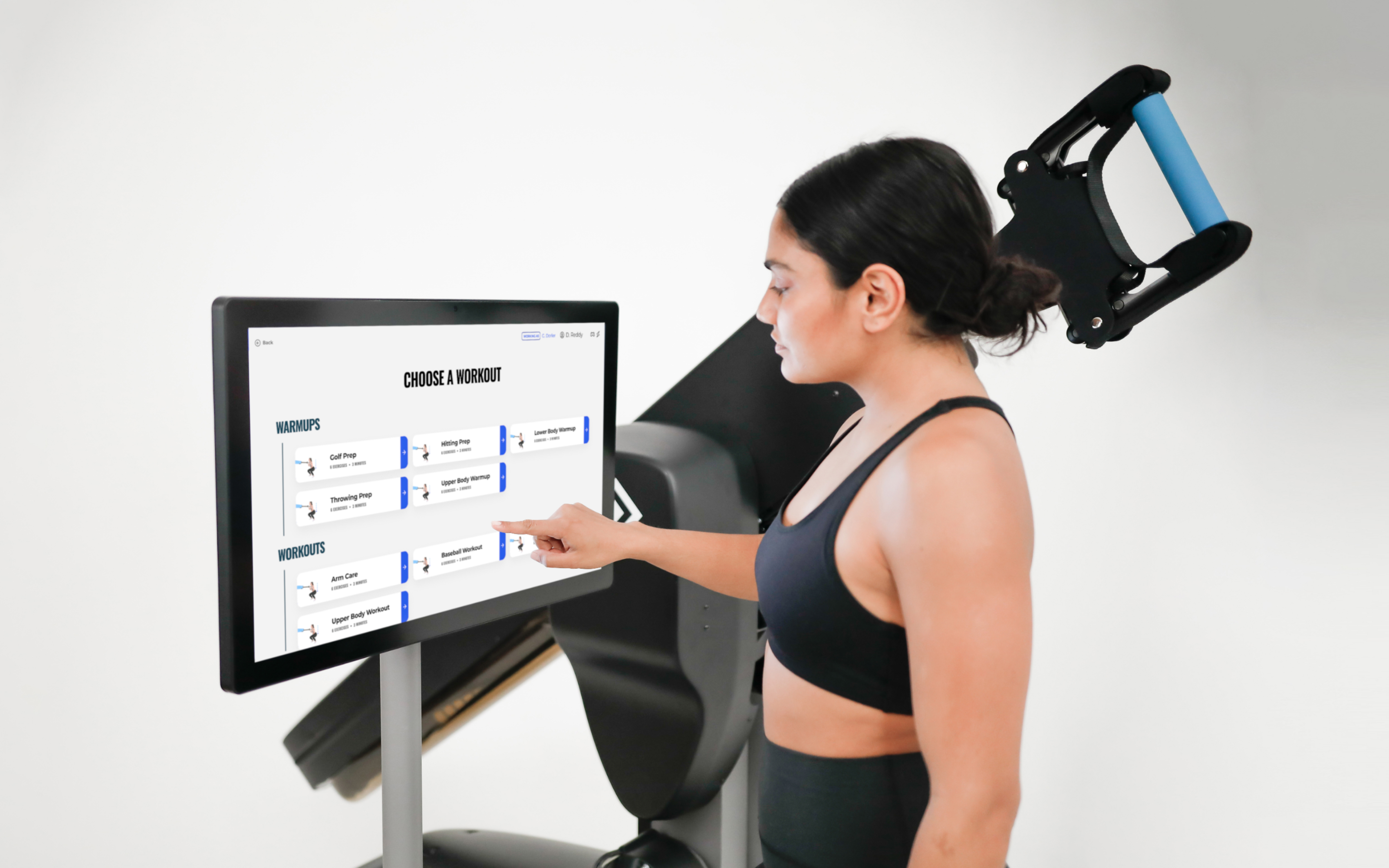
Proteus software guides users through 4-minute physical assessments, arming trainers with unprecended performance data and insights and creating an entirely new standard for personal fitness and physical rehabilitation.
While working at Proteus I was part of an ambitious project to create a new Insights and Recommendations feature. The feature gives users the power to:
︎︎︎Insights and Recommendations Explainer
︎︎︎Learn More About Proteus
Proteus software guides users through 4-minute physical assessments, arming trainers with unprecended performance data and insights and creating an entirely new standard for personal fitness and physical rehabilitation.
While working at Proteus I was part of an ambitious project to create a new Insights and Recommendations feature. The feature gives users the power to:
- Track their personal progress across Proteus Power-based tests
- Compare themselves against the norm for their age, sex, and sport
- Understand which body areas need the most attention
- Get training recommendations for every movement category
- Share their results to a personal device for on-the-go training
︎︎︎Insights and Recommendations Explainer


The Problem
Many athletes and trainers do not yet have the expertise to interpret and take the next best actions informed by the results of a Proteus Power-based test. These users also do not have a straightforward way to track their progress between tests, using awkward workarounds to compare two reports.


Previously, Proteus generated only a Power Report (right) to display a user’s results after completing a Power-based test (left). Power reports alone are not able to track user progress between different tests and do not provide recommendations for how a user might improve their performance in their problem areas.
The Challenge
Our goal for the project was to completely change the way our users personalize training by classifying the results of power-based tests and providing recommended exercises to help them to improve their future scores and athletic performance.
Simply put, a user may have a core that needs to train speed or legs that need to train strength, and Proteus will tell you this.
In more technical terms, users will have the option to compare their test results against other Proteus users in their cohort— determined by their age, sex, height, weight, sport, position, and skill level— or compare themselves against an aspirational cohort. For example, a baseball player on a high school team wants to compare himself against college-level players to increse his chances of recieving a sports scholarship.
The classifications are based on the percentile rankings of the power and acceleration scores for each movement category and will vary according to the filters set. Each movement category will be put into 1 of 4 classifications: Low Strength, Speed Dominant, Strength Dominant, or High Strength and Speed.
High-Level Goals
For the Business
For Trainers
For Athletes
- Drive increased usage of testing mode
- Increase client satisfaction with diagnostic testing mode
- Reinforce the fact that this powerful information is exclusively available on Proteus
For Trainers
- Give trainers topline understanding of their client’s testing results
- Supply trainers with recommendations that they can leverage to adapt and build training programs for their clients
- Engender greater trust in trainers by their athlete clients
- Facilitate tracking progression between testing sessions
For Athletes
- Give athletes topline understanding of their testing results
- Encourage athlete success in their fitness goals by showing progress made between tests
- Provide context to discuss their fitness goals with their trainers
- Facilitate tracking progression between testing sessions
My Role
I collaborated with Proteus’ Director of Product Design to design the new feature in 2022. We worked alongside the Director of Software Engineering, 3 Software Engineers, the Head of Human Performance and Sports Science, and Proteus’ CEO.
I participated in the process from start to finish, from creating early sketches and wireframes to designing pixel-perfect UI and participating in visual QA with the engineering team.
I participated in the process from start to finish, from creating early sketches and wireframes to designing pixel-perfect UI and participating in visual QA with the engineering team.

(Above) In the first round of wireframing we produced two possible directions for the new feature
Understanding Our Users’ Needs
Conducting User Interviews
Conducting User Interviews
Based on the project goals and requirements we created a first round of wireframes, which included two different approaches for how we might organize the data and information. Direction A was built around an existing navigation menu on the left side of the screen and presented all of the information in one long scroll. The second direction reimagined the navigation by replacing it with tabs at the top of the screen, providing users with different views for their overall test results and insights and recommendations.
We wanted to understand if and how this feature could provide the most value to our users so we conducted interviews with 5 trainers who actively use Proteus. We presented both directions to the trainers and gathered their first reactions and feedback. The Director of Product Design and I collaborated on the interview script. I took notes in Figjam during 4/5 interviews and I lead one of the interviews myself.
We wanted to understand if and how this feature could provide the most value to our users so we conducted interviews with 5 trainers who actively use Proteus. We presented both directions to the trainers and gathered their first reactions and feedback. The Director of Product Design and I collaborated on the interview script. I took notes in Figjam during 4/5 interviews and I lead one of the interviews myself.

(Above) A consolidated board of feedback and reactions to the first round of wireframes, expressed by 5 different trainers who actively use Proteus
Responding to User Feedback
Refining Wireframes
Refining Wireframes
The trainers interviewed showed a clear preference for Direction B’s layout and navigation, noting that it was very easy to scan for information. However, most trainers also found the clear trendlines and muscle diagrams proposed in Direction A to be of great value. We developed a final set of wireframes that combined the two directions according to these findings.
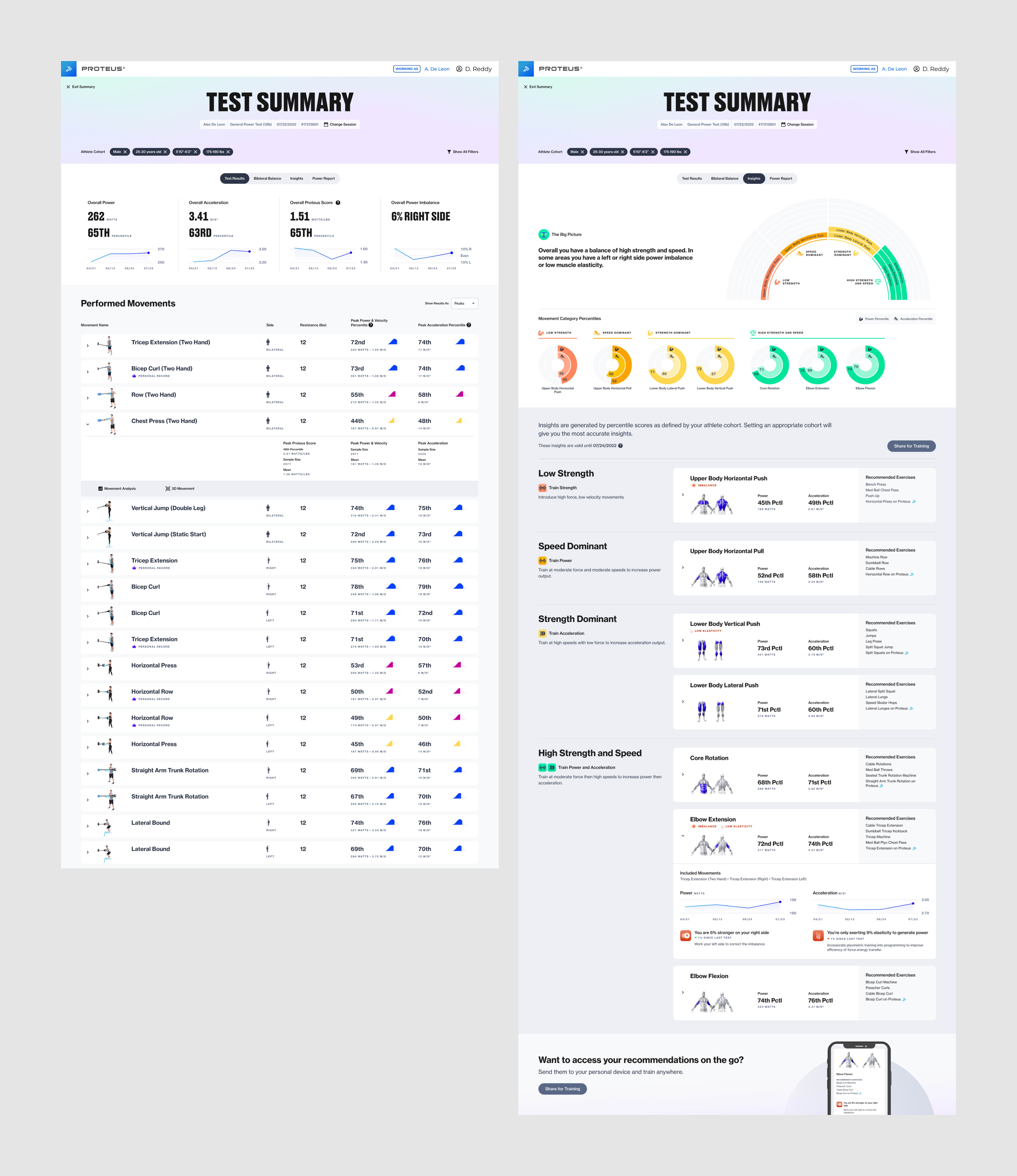
The Test Results tab delivers a topline overview of Average Power, Acceleration, Proteus Score, and Power Imbalance trends across all of the user’s tests. It lists the movements performed and percentile scores for each movement in a table below.
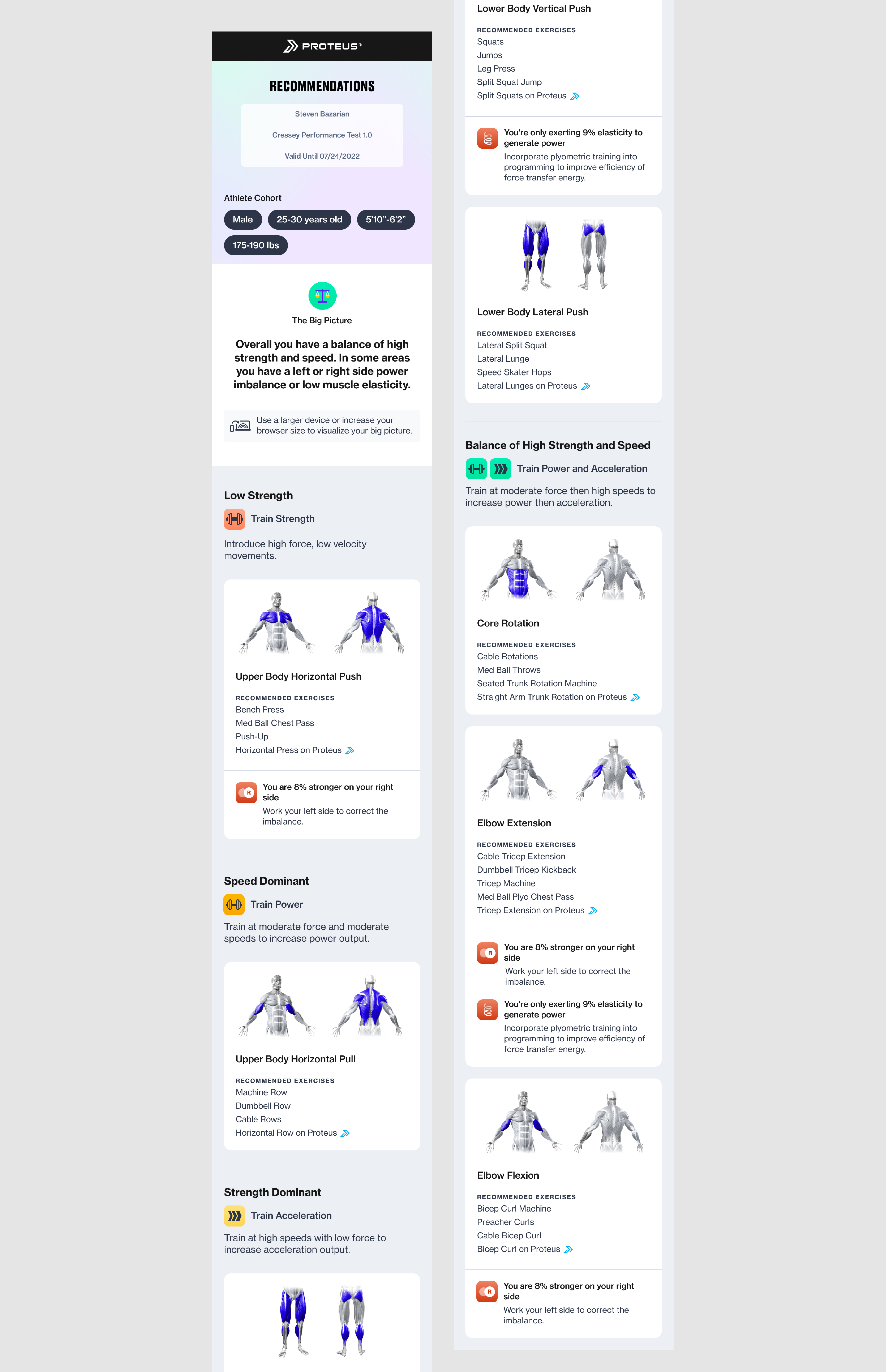
The Recommendations tab displays each movement category in its respective classification, explaining the meaning of the classifications and providing recommended exercises that can be performed on or off Proteus. Each movement category card can be expanded to display progress tracking for up to 4 recent tests, as well as plyometric or side imbalance data when applicable.
The Shared Recommendations is a web page that can be shared to a user’s personal device from the Proteus kiosk. It gives a consolidated overview of the user’s classifications and recommended exercises for use off Proteus or on-the-go.
The Test Results tab delivers a topline overview of Average Power, Acceleration, Proteus Score, and Power Imbalance trends across all of the user’s tests. It lists the movements performed and percentile scores for each movement in a table below.
The Recommendations tab displays each movement category in its respective classification, explaining the meaning of the classifications and providing recommended exercises that can be performed on or off Proteus. Each movement category card can be expanded to display progress tracking for up to 4 recent tests, as well as plyometric or side imbalance data when applicable.
The Shared Recommendations is a web page that can be shared to a user’s personal device from the Proteus kiosk. It gives a consolidated overview of the user’s classifications and recommended exercises for use off Proteus or on-the-go.

(Above) Refined wireframes for Test Results and Recommendations based on our findings from the trainer interviews


(Above) The pre-existing Bilateral Balance view and Power Report were incorporated into this feature but they did not undergo a full redesign at this time.
Working Backwards from Perfect
Crafting the Insights Visualization
Crafting the Insights Visualization
Before we could jump into the visual design phase, it was important to ensure that the data visualizations we display at the top of the feature will properly aid the user in their understanding of their insights and recommendations. After much team discussion and many rounds of iterating, we decided to add a new visualization to the top of the Insights view.
We came up with a unique visualization reminiscent of a fan chart that displays each movement category in its classification. The chart is color coded to further signal where users should aspire to be— red indicates a balance of low scores in both Power and Acceleration and green indicates a balance of high scores. Orange and Yellow indicate an imbalance between scores.
We designed a second visualization in the form of donut charts that displays the user’s Power and Acceleration percentile numbers, providing a quick glance at the data that dermined the classifications.
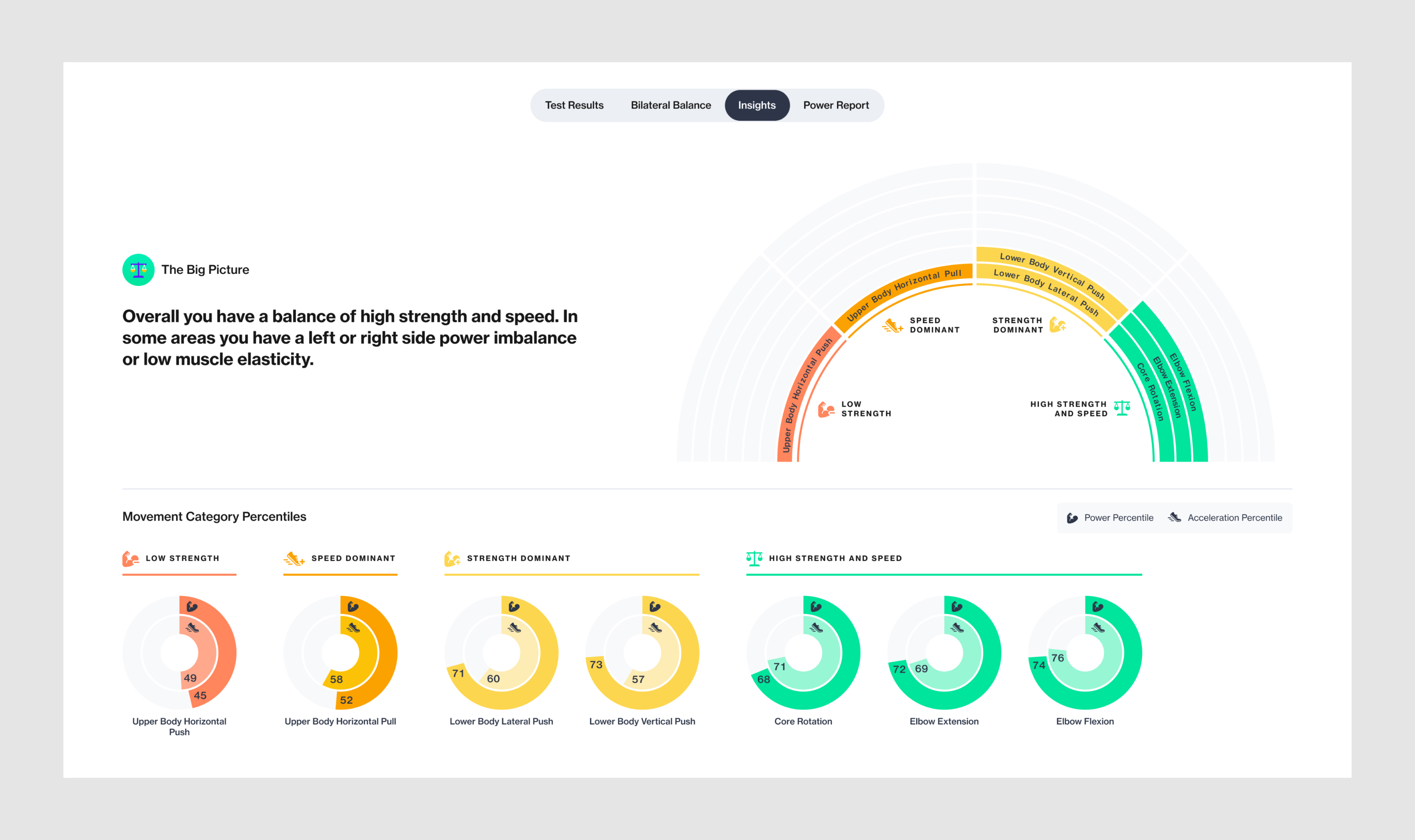
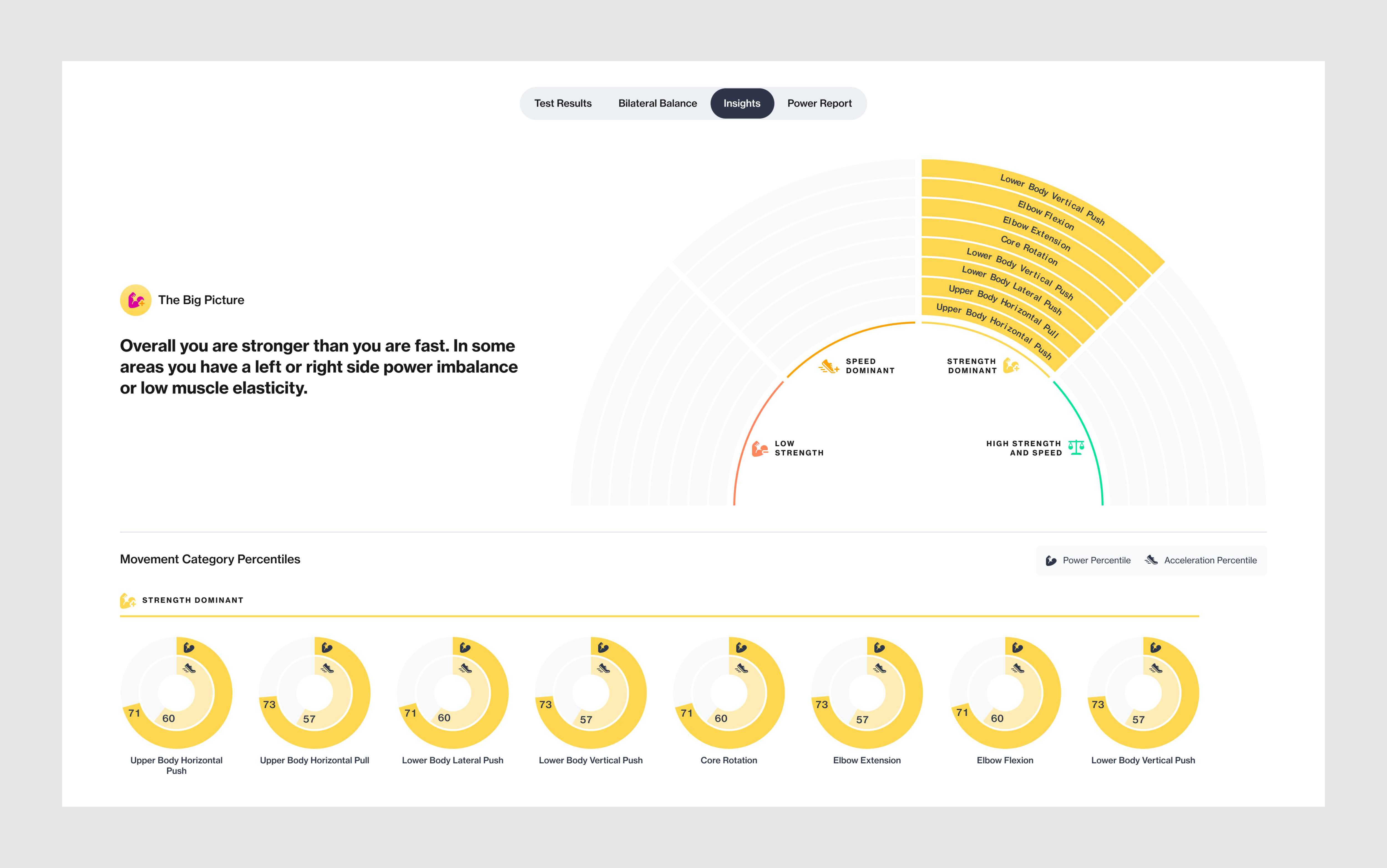

(Above) Three different permuatations of the Insights visualization showing 1. A user with movement categories falling in mixed classifications, 2. A user with all movement categories falling in the same classification, and 3. Results of a test with a smaller number of performed movements.
Visual Design
Designing Pixel-Perfect UI
Designing Pixel-Perfect UI
Working from Proteus’ evolving design system, we created visual designs from our wireframes. Proteus’ Director of Product Design defined the baseline of the new design system and it is constantly evolving as existing features are redesigned and new features are added to the software.
(Above) Final visual designs for the Test Results and Insights views. 1920x1080 kiosk size
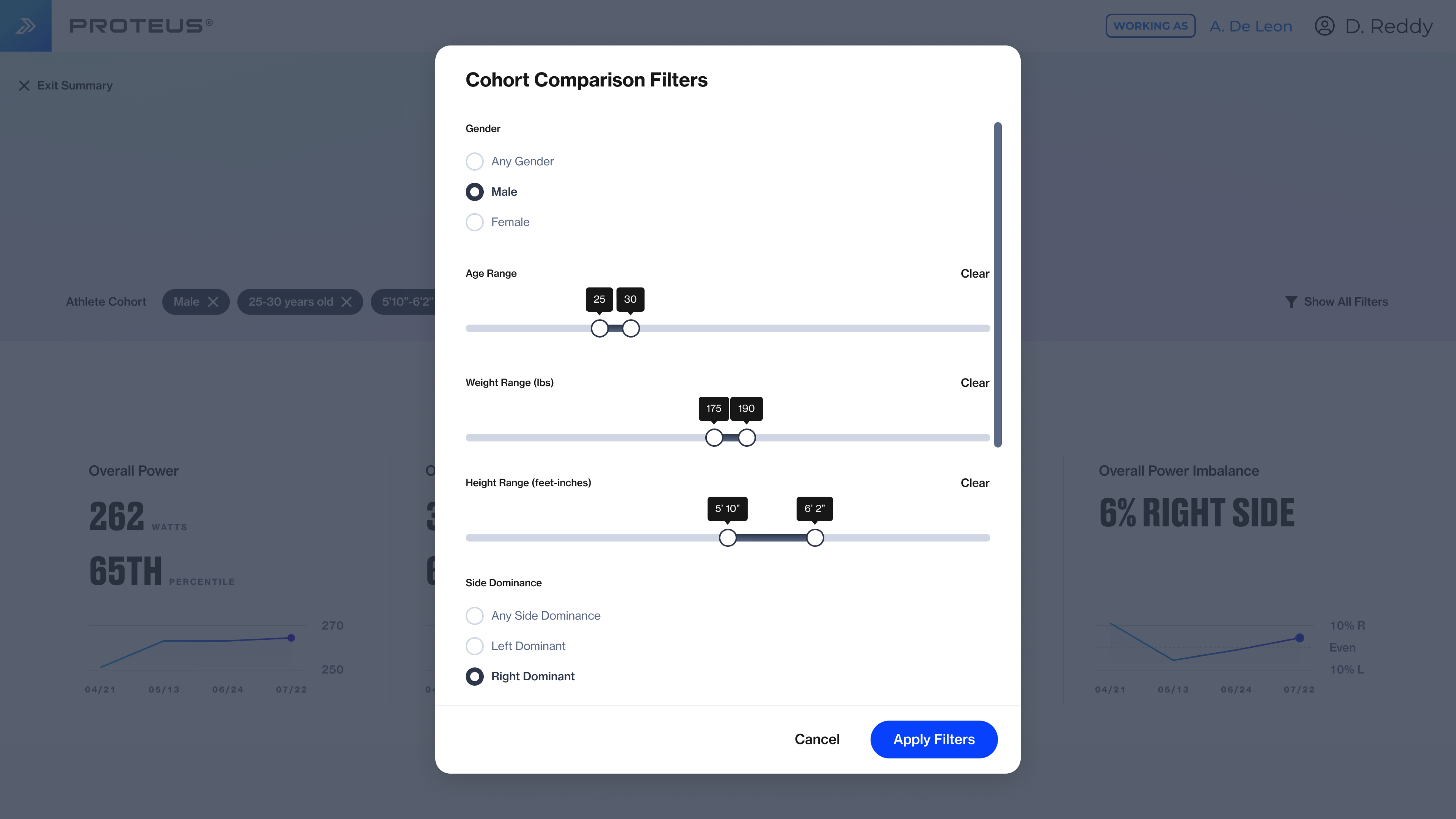

(Above) Filters modal and Test Selection modal. 1920x1080 kiosk size
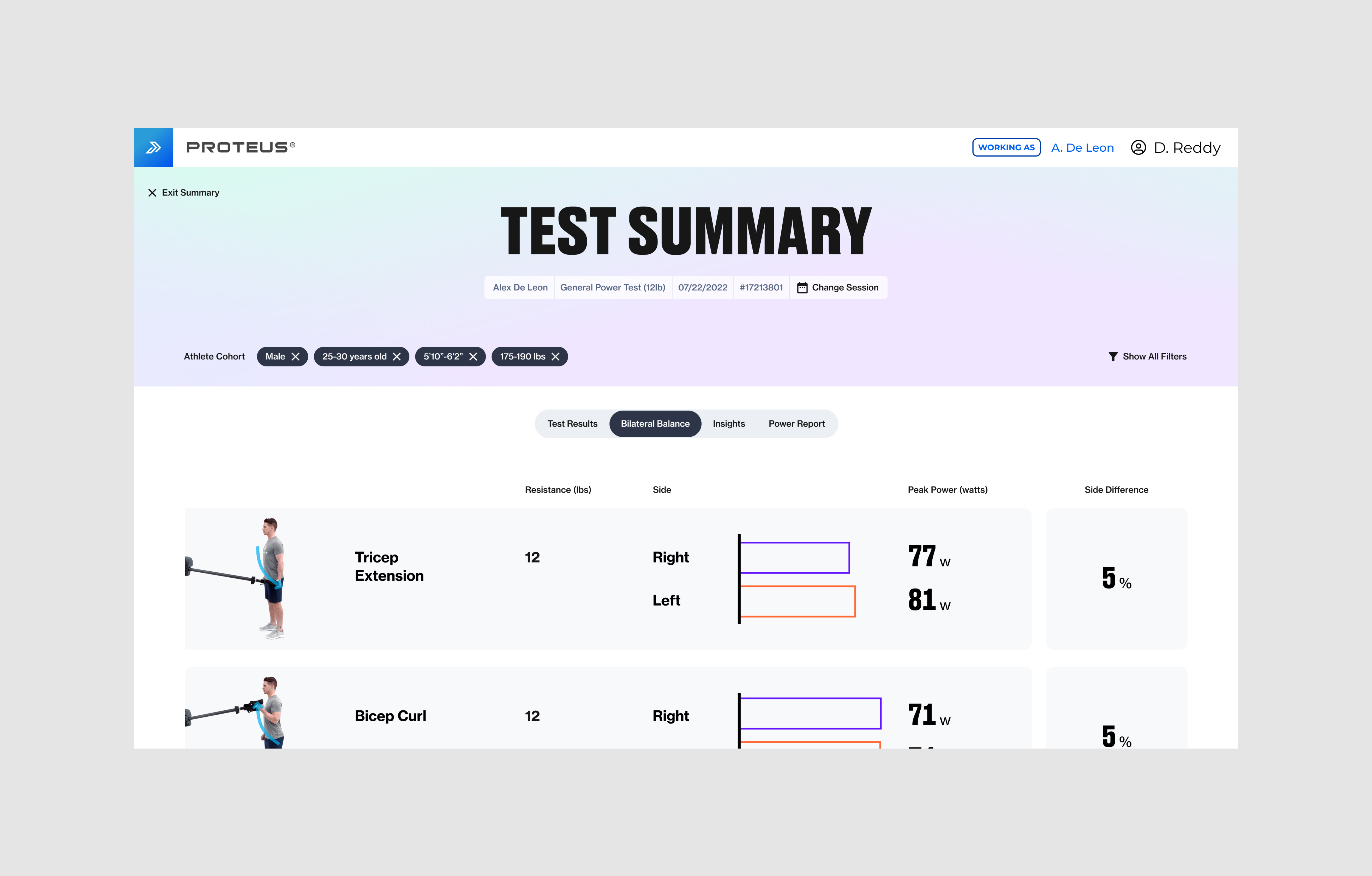
(Above) Final visual design for the Bilateral Balance view. This view recieved a simple reskin of fonts and colors but the UX did not change at this time.
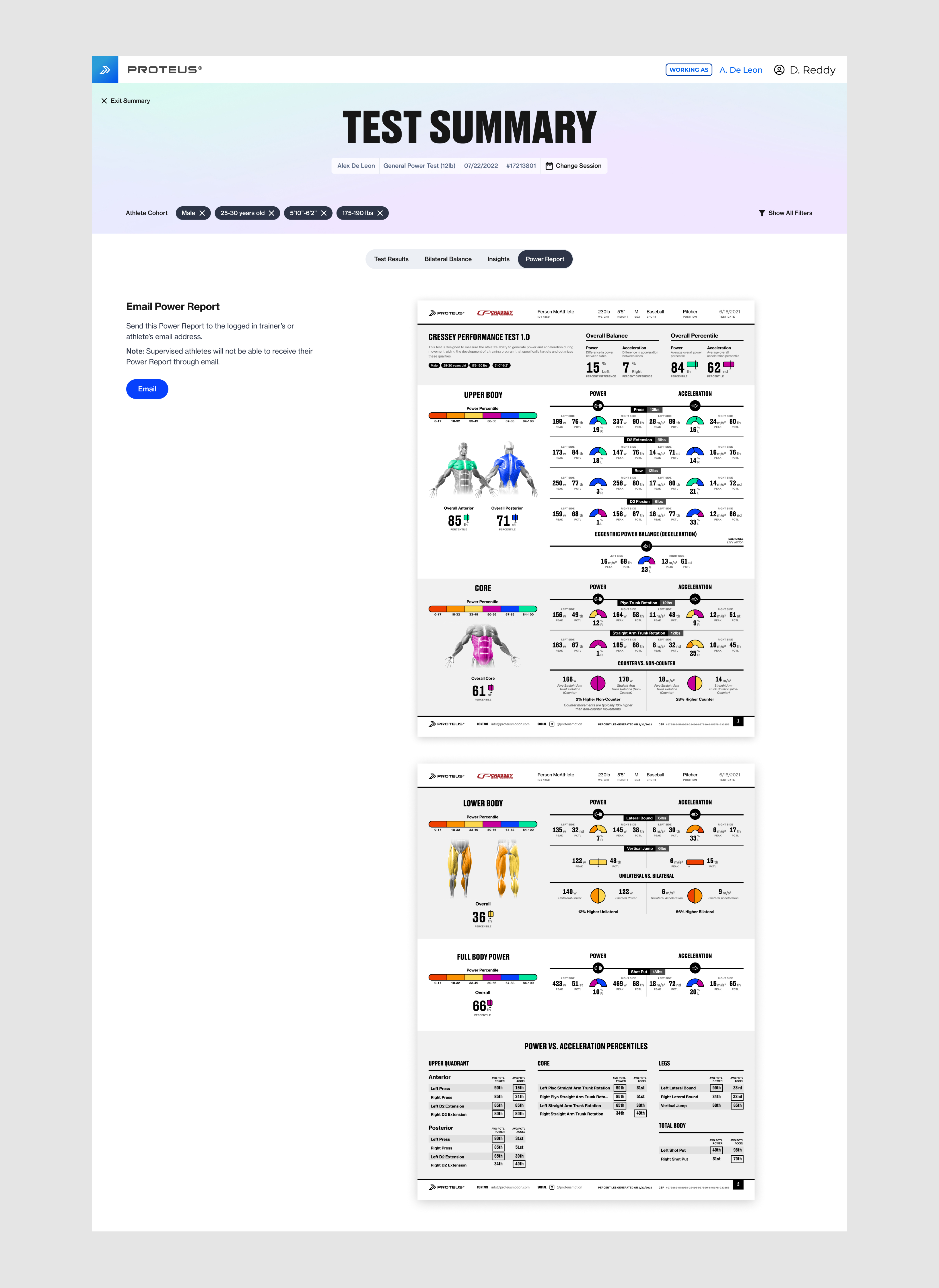
(Right) Final visual design for the Power Report view
1920x1080 kiosk size

(Above) A selection of edge case examples for the Insights view. 1920x1080 kiosk size
Responsive Web Design
Designing for Large and Medium Breakpoints
Designing for Large and Medium Breakpoints
Most Proteus units are installed in sports performance or rehabilitation facilites, therefore many users do not have access to its software features at home or on the go. We created responsive designs for desktop, laptop, and tablet sizes so users can view the Insights and Recommendations feature from their personal computers or tablets.

(Above) Responsive designs for the Insights view
Sharing Recommendations
Insights and Recommendations On-The-Go
Insights and Recommendations On-The-Go
While users can access Insights and Recommendations on their personal devices, the Shared Recommendations feature allows athletes to take home a condensed, straight-forward version for on-the-go training anywhere.
Shared Recommendations is a webpage that displays the cohort filters selected at the time the link was shared, classifications for each movement category and the corresponding recommended exercises, and plyometrics and side imbalance information when applicable.
Users can choose “Share for Training” from the Insights view on the Proteus kiosk, which will prompt them to either scan a QR code or send the link to their email address.

(Above) Recommendations can be shared from both the top and bottom of the Insights view

(Above) The sharing flow, from top to bottom. Illustrations designed by me.
(Above) Final visual designs for Shared Recommendations. 375px mobile size.
Responsive Designs
Designing for X-Small, Small, Medium, and Large Breakpoints
Designing for X-Small, Small, Medium, and Large Breakpoints
We optimized the Shared Recommendations design for mobile, as this is is the device most users will have with them on the go, but we designed it at 4 different breakpoints so it can be viewed efficiently on any personal device.

(Above) Responsive designs for Shared Recommendations at the XS, S, M, L breakpoints.

(Above) A selection of edge case examples for Shared Recommendations
Additional Project Credits
Will Gabrenya
Director of Product Design
Jason Shaev
Director of Software Engineering
Will Waterman
Head of Human Performance and Sports Science
Sam Miller
CEO of Proteus Motion
Director of Product Design
Jason Shaev
Director of Software Engineering
Will Waterman
Head of Human Performance and Sports Science
Sam Miller
CEO of Proteus Motion
Brendan Kelly
Senior Software Engineer
Andres Gonzalez
Software Engineer
Doug Moore
Software Engineer
Designed at Proteus Motion, 2022
Senior Software Engineer
Andres Gonzalez
Software Engineer
Doug Moore
Software Engineer
Designed at Proteus Motion, 2022
Proteus Motion: Help Resources
Role: Product Designer, UI/UX
For: Android App & Web
Tool: Figma
Role: Product Designer, UI/UX
For: Android App & Web
Tool: Figma
Proteus® is a revolutionary performance testing device combined with a powerful new resistance training tool. Proteus’ patented 3D Resistance and Software Insights unlocks the first and only way to measure strength and power for every human movement, so Proteus can deliver the most personalized training insights in history.
︎︎︎Learn More About Proteus
While working at Proteus I designed a Help Resources modal, which helps users find answers to all their Proteus usage questions.
︎︎︎Learn More About Proteus
While working at Proteus I designed a Help Resources modal, which helps users find answers to all their Proteus usage questions.

The Problem
Proteus is a complex product and therefore our users require education in its basic usage. Being a new product with mechanical and software components, customers frequently request support or are in need of reference content. The burden of addressing numerous field issues and educating our customers is handled by our Customer Service, Human Performance, and Engineering teams, which create significant demands on their time.
(Above) Previously, Proteus relied on onboarding and how-to videos to provide answers to usage questions but there was no central location for reference materials in the software
The Challenge
Our goal for the project was to create a central location for all Proteus support and reference content, which can be accessed from any screen in the app or any page in the Proteus web experience. The content needs to be accesible to all users whether they are logged into a Proteus account or not.
The help resources modal will contain multiple tabs that help a user familiarize themselves with Proteus, learn how to use the machine, and learn how to reach out if additional assistance is needed.
The help resources modal will contain multiple tabs that help a user familiarize themselves with Proteus, learn how to use the machine, and learn how to reach out if additional assistance is needed.
High-Level Goals
For the Business
For Trainers
For Athletes
- Reduce time spent by Human Performance onboarding new customers
- Reduce time spent by Customer Success and Engineering addressing existing customer issues
For Trainers
- Increase understanding of how to use Proteus
- Enable better day to day outcomes while using Proteus
- Provide easy access to reference materials
- Increase confidence that Proteus Motion is able to address their service needs
For Athletes
- Provide easy access to reference materials
My Role
I led the design of this new feature, working closely with Proteus’ Director of Product Design for feedback. I worked alongside the Director of Software Engineering, the Head of Field Operations, and 1 Software Engineer.
I participated in the process from start to finish, from creating user flows and wireframes to designing pixel-perfect UI and assisting with visual QA.
I participated in the process from start to finish, from creating user flows and wireframes to designing pixel-perfect UI and assisting with visual QA.


(Above) User Flows for a logged in user and a user who is not logged in or has not created a Proteus account
Sketching Ideas
User Flows and the First Round of Wireframes
User Flows and the First Round of Wireframes
It’s important that the Help Resources feature is available to users whether logged in or out of Proteus, as new users often have questions before creating their account. Based on the project goals and requirements, I started by brainstorming ideas for user flows, taking both scenarios into account.

(Above) In the first round of wireframing I designed two different directions for the new Help Resources modal
Refining Wireframes
An Emphasis on Future Scalability
An Emphasis on Future Scalability
After establishing the initial user flows I designed a first round of wireframes, which included two different approaches for how we might organize the different help categories and topics and where we might surface the option to submit a support request. Direction A divides each help category into tabs, while Direction B is a long scroll that prioritizes the help topics at the top and provides additional context for each topic.
Although we only have a limited number of help categories and topics at the moment, we want this feature to be able to scale as we add more in the future. For this reason, we chose to move forward with Direction A.
Although we only have a limited number of help categories and topics at the moment, we want this feature to be able to scale as we add more in the future. For this reason, we chose to move forward with Direction A.
(Above) Refined wireframes for the new Help Resources modal
The Access Point
Navigating to the Modal
Navigating to the Modal
In order to ensure the Help Resources modal can be accessed from anywhere in the Proteus app or web experience, I designed an icon in the global nav that acts as the access point. The global nav appears on almost every screen of the Proteus app and almost every page of the Proteus web experience, with the exception of the Log In page and Training Mode flow.
In these exceptions the access point exists in the top right corner of the screen or page, in the same position it would in the global nav.
In these exceptions the access point exists in the top right corner of the screen or page, in the same position it would in the global nav.

(Above) Permutations of the global nav and access point icon. 1920x1080 kiosk size

(Above) Responsive web designs for the global nav and access point


(Above) The global nav is not present in Testing Mode or on the Login screen but the access point remains in the top right corner. Testing Mode did not undergo a redesign at this time. The login page was reskinned but the UX did not change at this time.
Visual Design
Designing Pixel-Perfect UI
Designing Pixel-Perfect UI
Working from Proteus’ evolving design system, I created visual designs from the wireframes. Proteus’ Director of Product Design defined the baseline of the new design system and it is constantly evolving as existing features are redesigned and new features are added to the software.
(Above) Visual designs for the Basic Operations tab of the Help Resources modal

(Above) Visual designs for the About Proteus and Get Support tabs
Responsive Designs
Designing for Large and Medium Breakpoints
Designing for Large and Medium Breakpoints
In order to ensure users can access Help Resources in the Proteus web experience, I created responsive designs for desktop, laptop, and tablet sizes. The Proteus web experience does not currently scale to mobile.
(Above) Responsive designs for the Help Resources modal.
Additional Project Credits
Will Gabrenya
Director of Product Design
Jason Shaev
Director of Software Engineering
Marin Varney
Head of Field Operations and Engineering
Director of Product Design
Jason Shaev
Director of Software Engineering
Marin Varney
Head of Field Operations and Engineering
Proteus Motion: Marketing Rebrand
Role: Visual Designer
For: Brand Identity & Marketing Assets
Tool: Adobe Photoshop, Adobe Ilustrator, Figma
Role: Visual Designer
For: Brand Identity & Marketing Assets
Tool: Adobe Photoshop, Adobe Ilustrator, Figma
Proteus® is a revolutionary performance testing device combined with a powerful new resistance training tool. Proteus’ patented 3D Resistance and Software Insights unlocks the first and only way to measure strength and power for every human movement, so Proteus can deliver the most personalized training insights in history.
While working at Proteus Motion, I collaborated with Proteus’ creative director to create a new brand identity for the company.
While working at Proteus Motion, I collaborated with Proteus’ creative director to create a new brand identity for the company.

The new Proteus identity is bold, dynamic, and modern. The soft gradient backgrounds are reminiscent of the matte texture of the machine and the blue is used as a primary spot color throughout the identity, imitating the way it’s used as a spot color on the machine's handle.


Above: We created a brand guidelines document that acts as a starting point, with the intention that it will evolve over time as the company grows.
Public Media Group of Southern California
Role: Lead Visual Designer
For: Web
Tool: Figma
Role: Lead Visual Designer
For: Web
Tool: Figma
The Public Media Group of Southern California (PMGSC) is a non-profit broadcasting organization operating two TV stations and a non-commercial satellite television channel. PMGSC partnered with AREA 17 for a redesign of their three sites: KCET, LinkTV, and PBS SoCal.
︎︎︎KCET
︎︎︎LinkTV
︎︎︎PBS SoCal
︎︎︎KCET
︎︎︎LinkTV
︎︎︎PBS SoCal
Building a flexible design system
This project was uniquely challenging because we had to design a system that could be applied across all three of PMGSC’s websites, despite each having its own unique brand identity. Because KCET had recently undergone a robust rebrand, the KCET-specific pages were designed to incorporate all of its new brand elements, while the shared templates were designed to be easily be skinned and used across the other two sites.
The shared templates incorporate one primary brand color and one CTA and icon color for each site, with the exception of PBS SoCal, which uses its southern california orange for icons and buttons and blue for links.

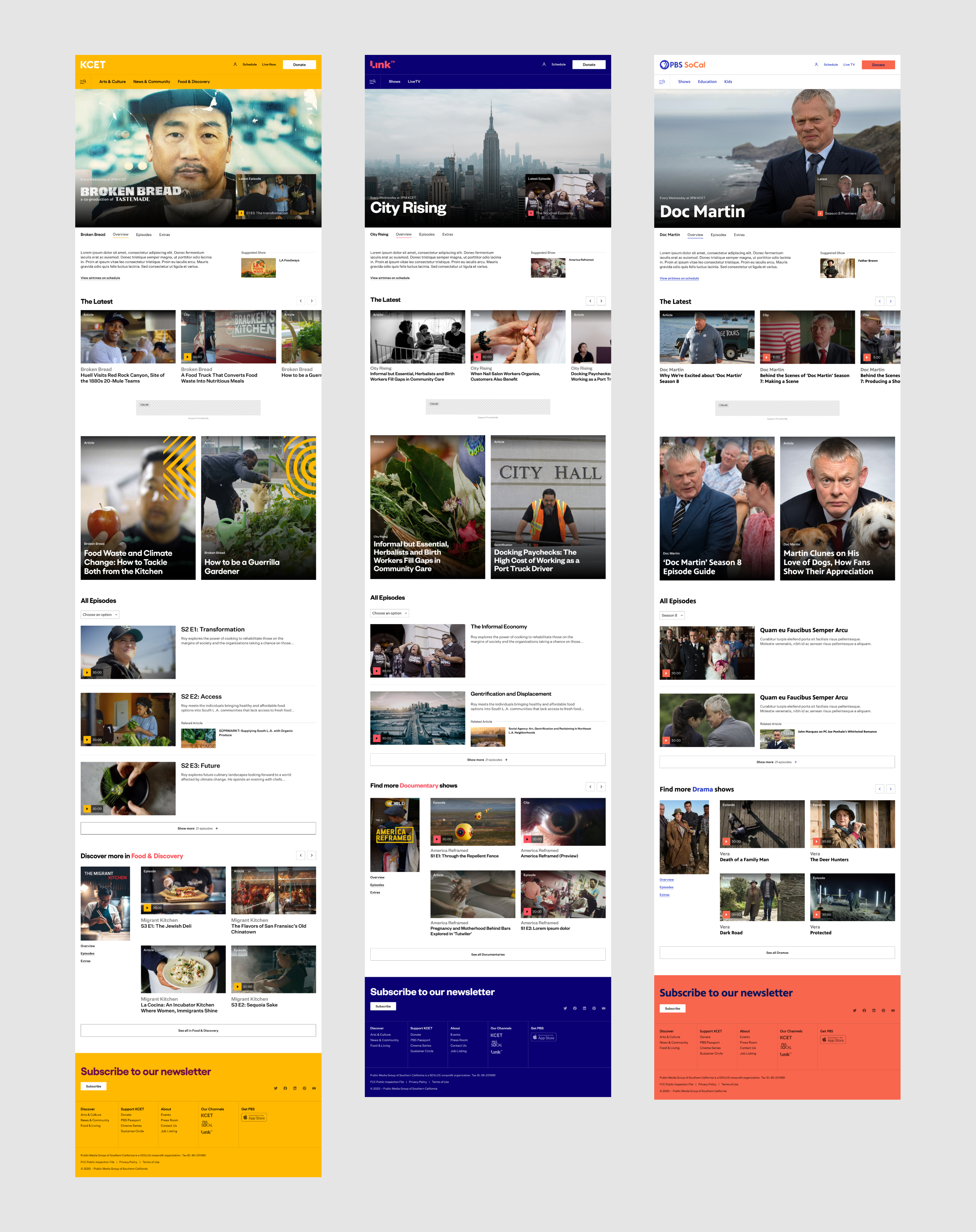
Above: Shows landing page template, applied across all three of PMGSC’s sites.
Because the Collections pages are unique to the KCET site, this was a perfect opportunity to introduce high brand moments in a way that makes sense in the context of the broader system. Although yellow is used as the primary color across the KCET site, it is replaced by other brand colors in the collections pages, creating a clear visual distinction between them.
The hero carousels were designed to incorporate one of KCET’s primary brand elements, a grid-based layout with patterns representative of the letters in K-C-E-T.

Each of the three sites features different types of content, including articles, video clips, and episodes.
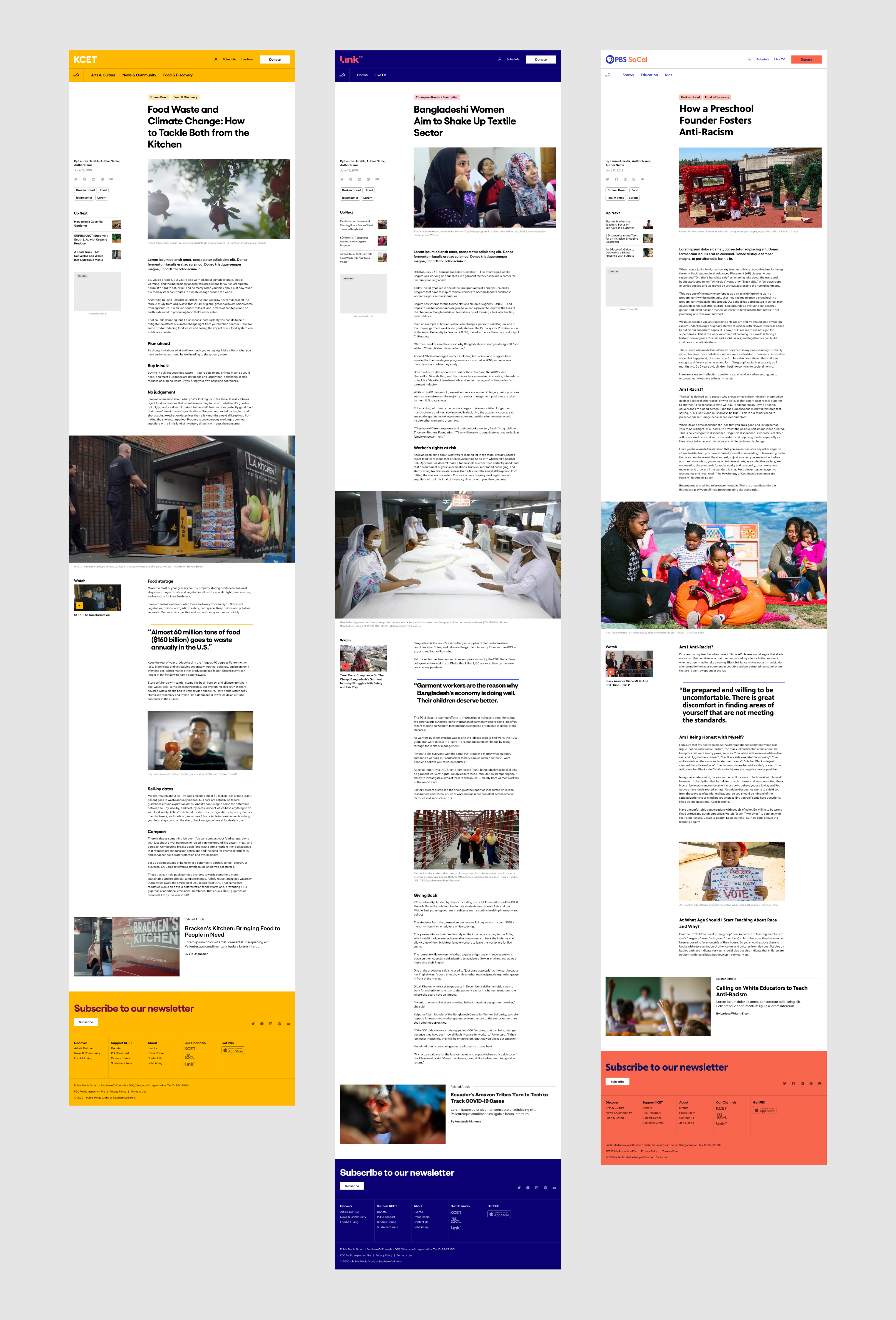
Above: Article template, applied across all three of PMGSC’s sites.
Additional Project Credits:
Carolyn Centeno Milton
Strategy Director
Marius Roosendaal
Design Director
David Lamonthe
Design Director
Patrick Vézina
Interface Engineer
Strategy Director
Marius Roosendaal
Design Director
David Lamonthe
Design Director
Patrick Vézina
Interface Engineer
Benoit Lemoine
Designer, KCET rebrand
Brendan Lam
Senior UX Designer
Jesse Golomb
Strategist
Website designed at AREA 17, 2020
Designer, KCET rebrand
Brendan Lam
Senior UX Designer
Jesse Golomb
Strategist
Website designed at AREA 17, 2020
Museum of the American Revolution Interactives
For: Web, Interactive
Tool: Figma
Role: Lead Visual Designer
For: Web, Interactive
Tool: Figma
The Museum of the American Revolution “uncovers and shares compelling stories about the diverse people and complex events that sparked America’s ongoing experiment in liberty, equality, and self-government. It promises to face hard truths, have open dialogue about the complexities of our nation’s history, and lift up stories that have often gone untold”.
︎︎︎Season of Independence
︎︎︎Finding Freedom
︎︎︎Season of Independence
︎︎︎Finding Freedom
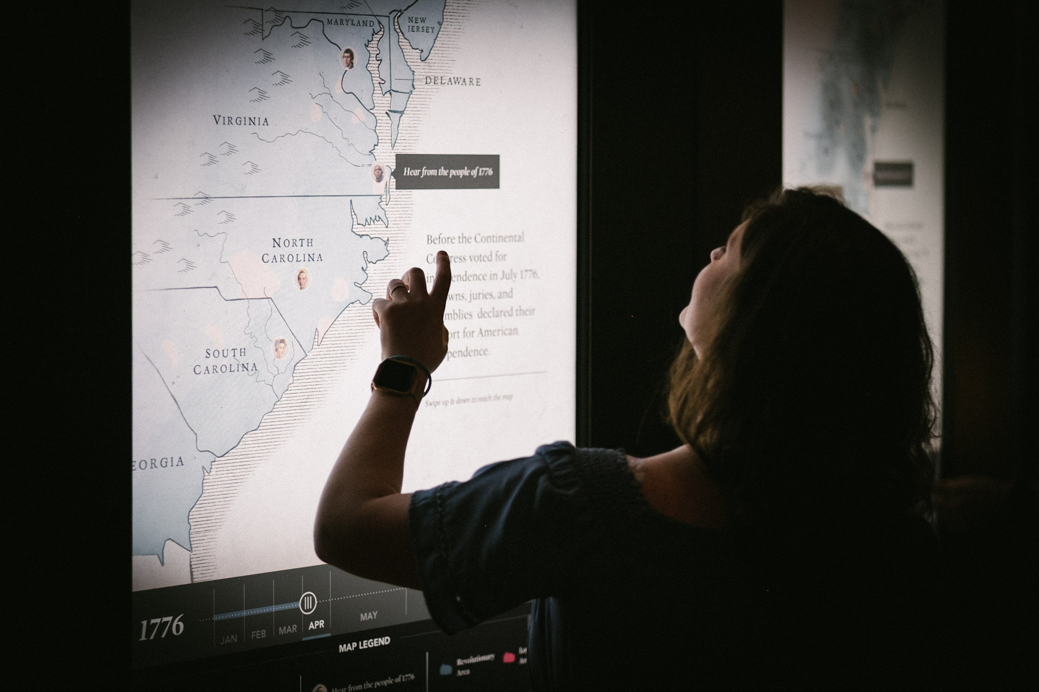
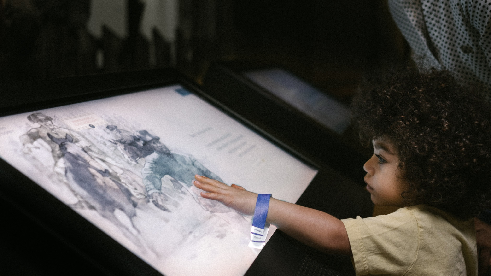
The Museum of the American Revolution partnered with AREA 17 for a redesign of two interactives, which we translated from their museum exhibit kiosks to the museum website. Because our primary users are teachers using classroom iPads, we focused primarily on tablet and mobile sizes throughout the design process.
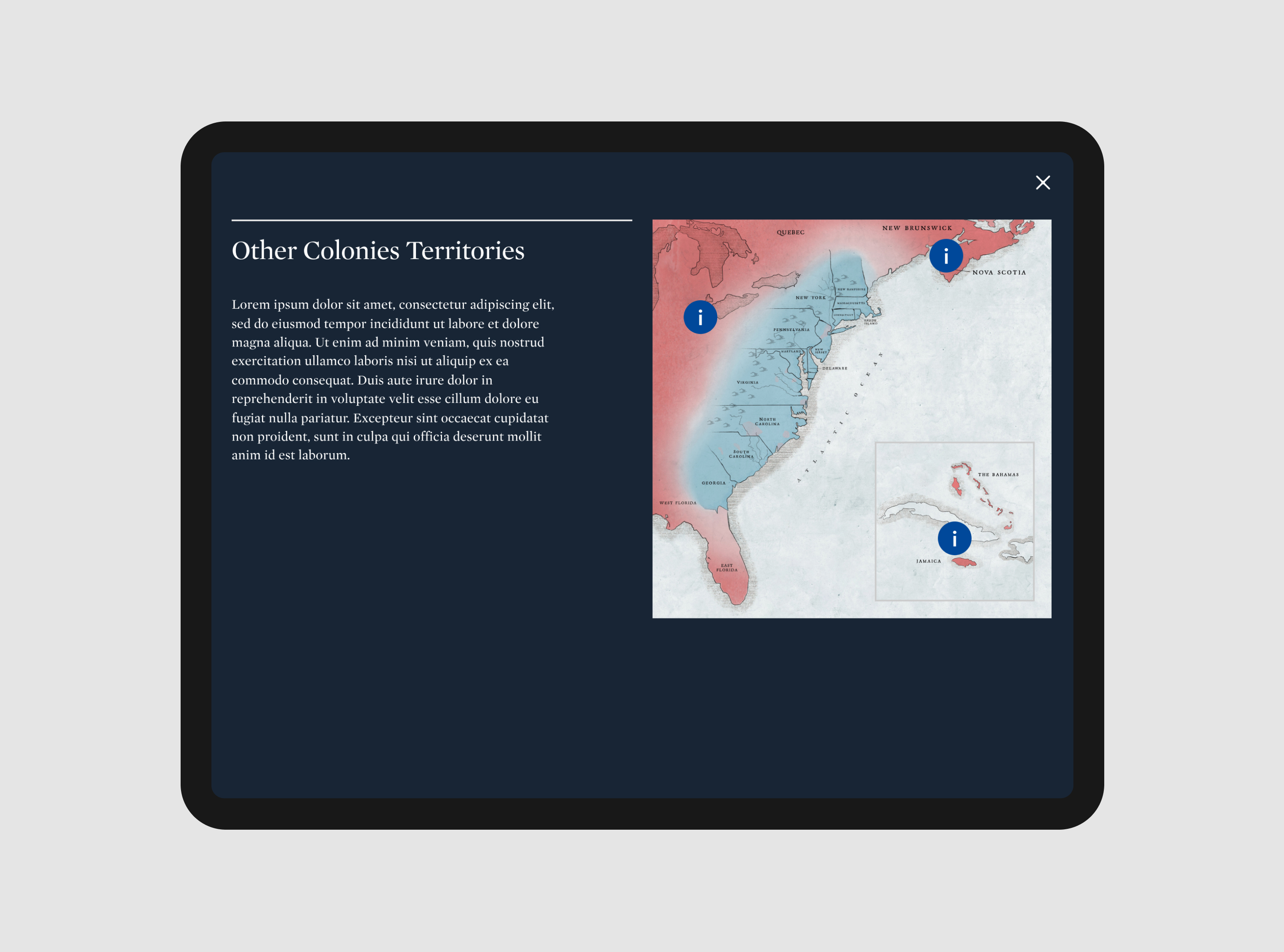
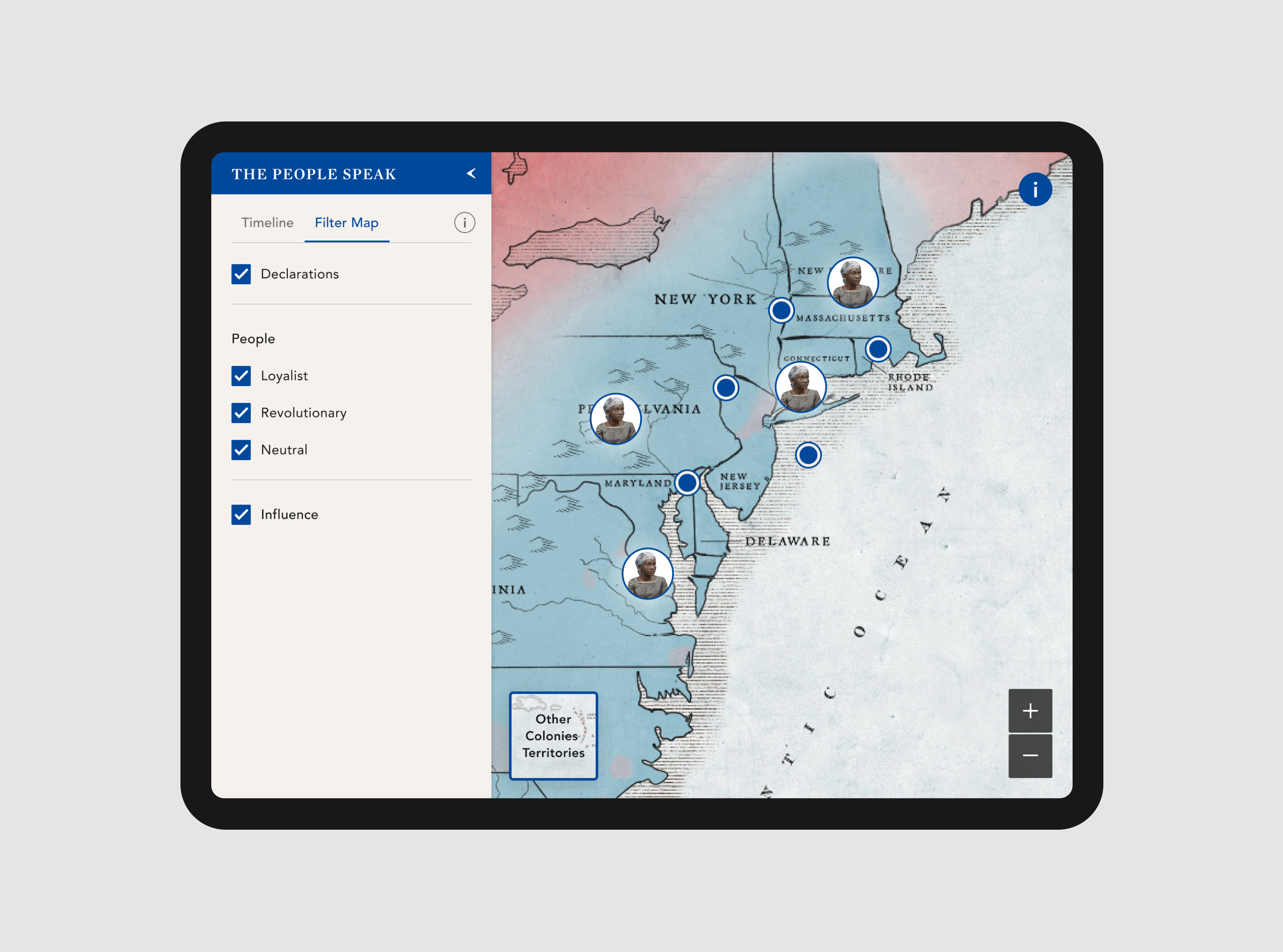
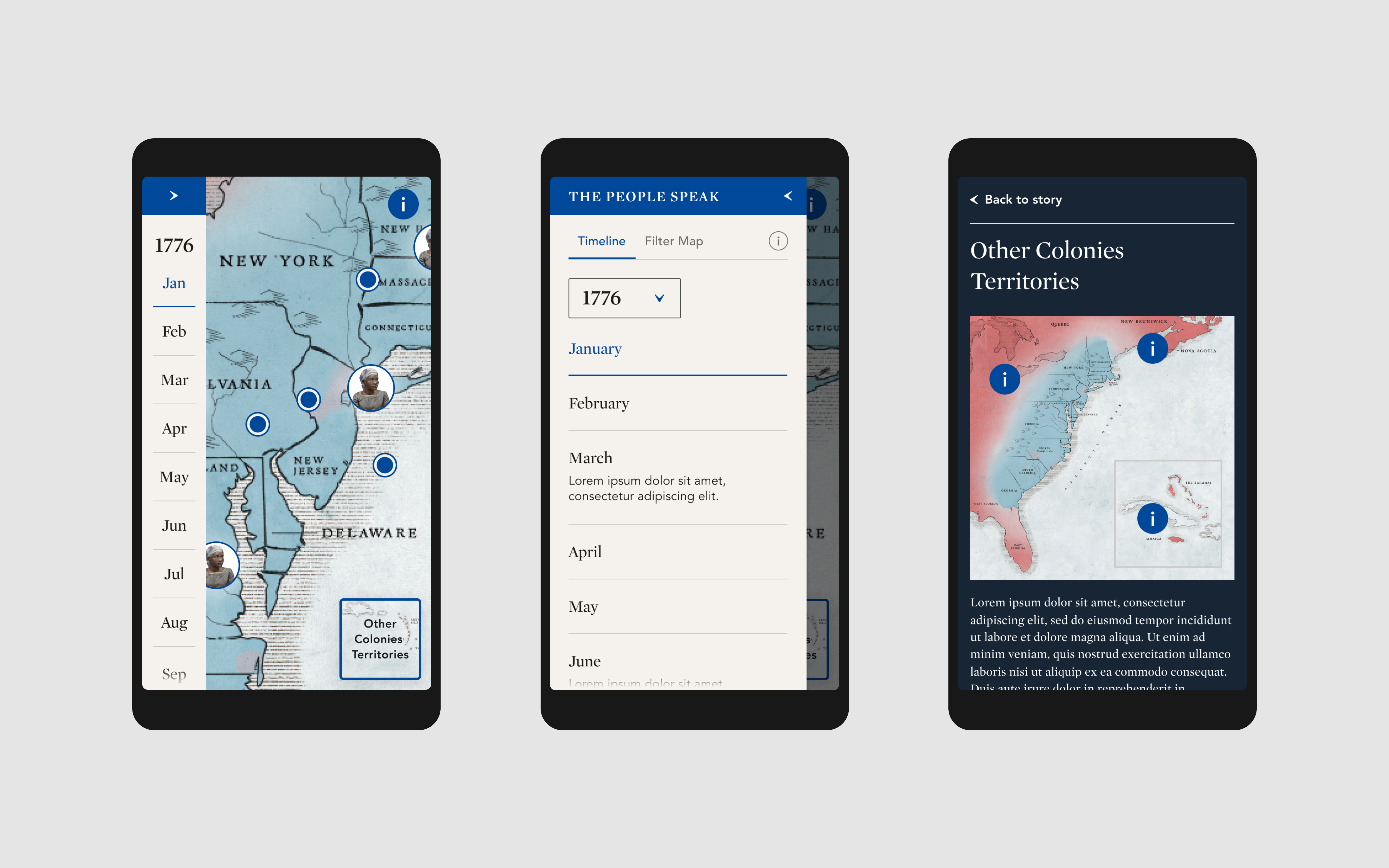
Season of Independence invites visitors to explore interactive data visualizations that map the growing support for rebellion leading up to the composition of the Declaration of Independence.

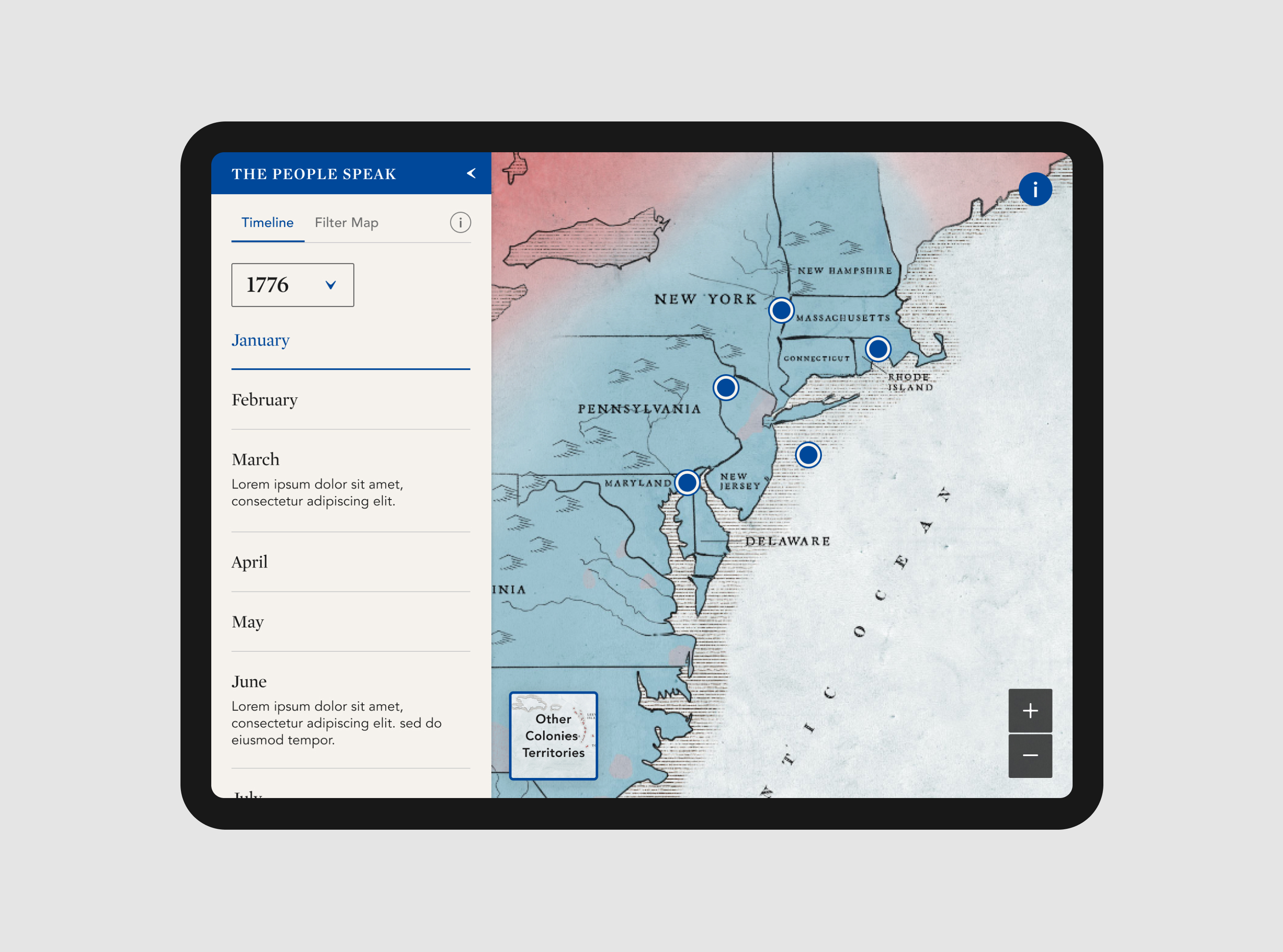
Using a map and timeline as its foundation, Season of Independence tracks statements of support for independence across the 13 American colonies in rebellion over time, while placing those colonies in larger geographic context. Throughout, it presents the voices of those who supported independence, disagreed, and hoped to avoid a war altogether.

The interactive includes a collapsable panel that allows the user to filter data points by date, declarations and/or people, and the faction(s) they most closely identified with.
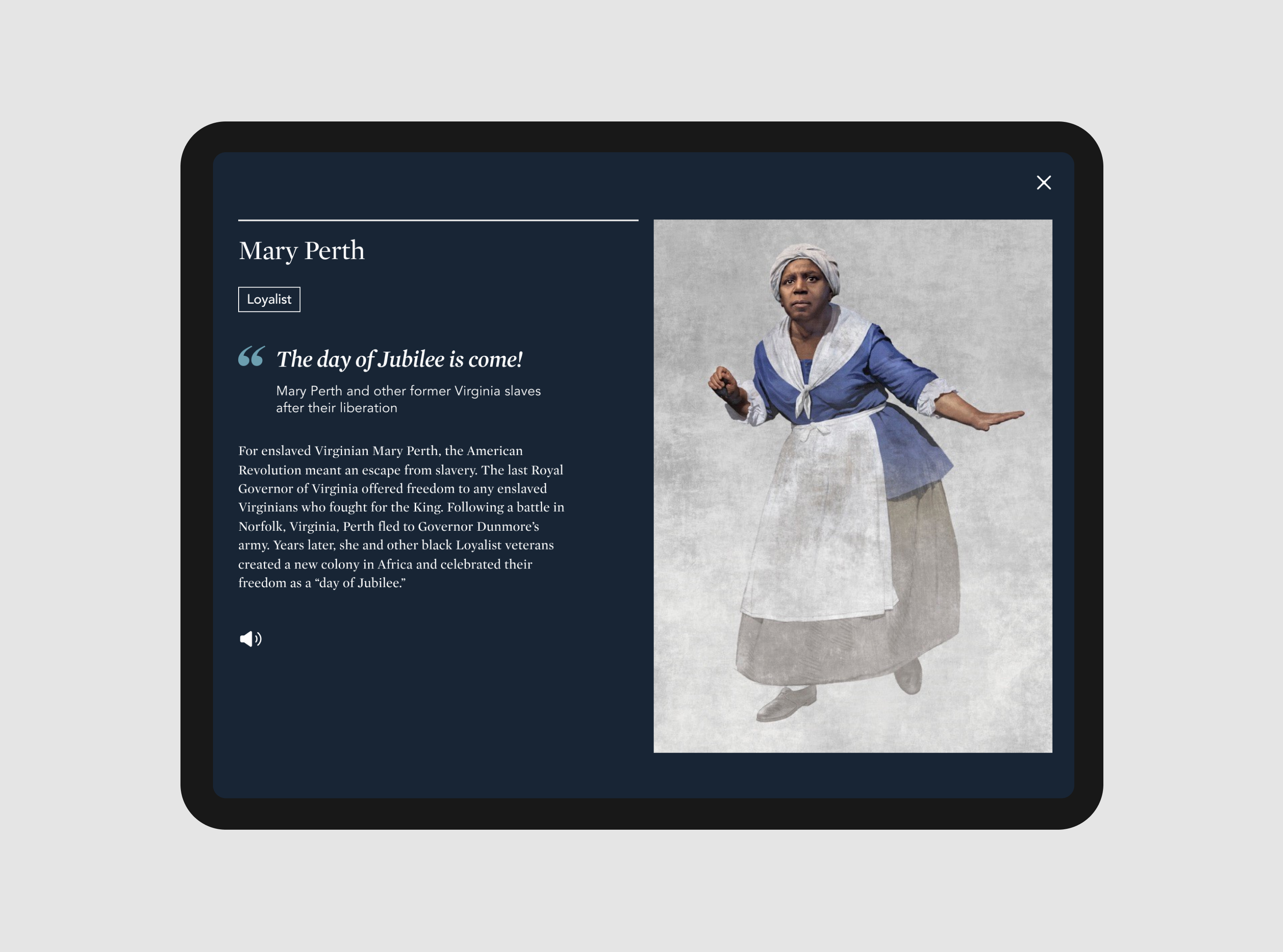
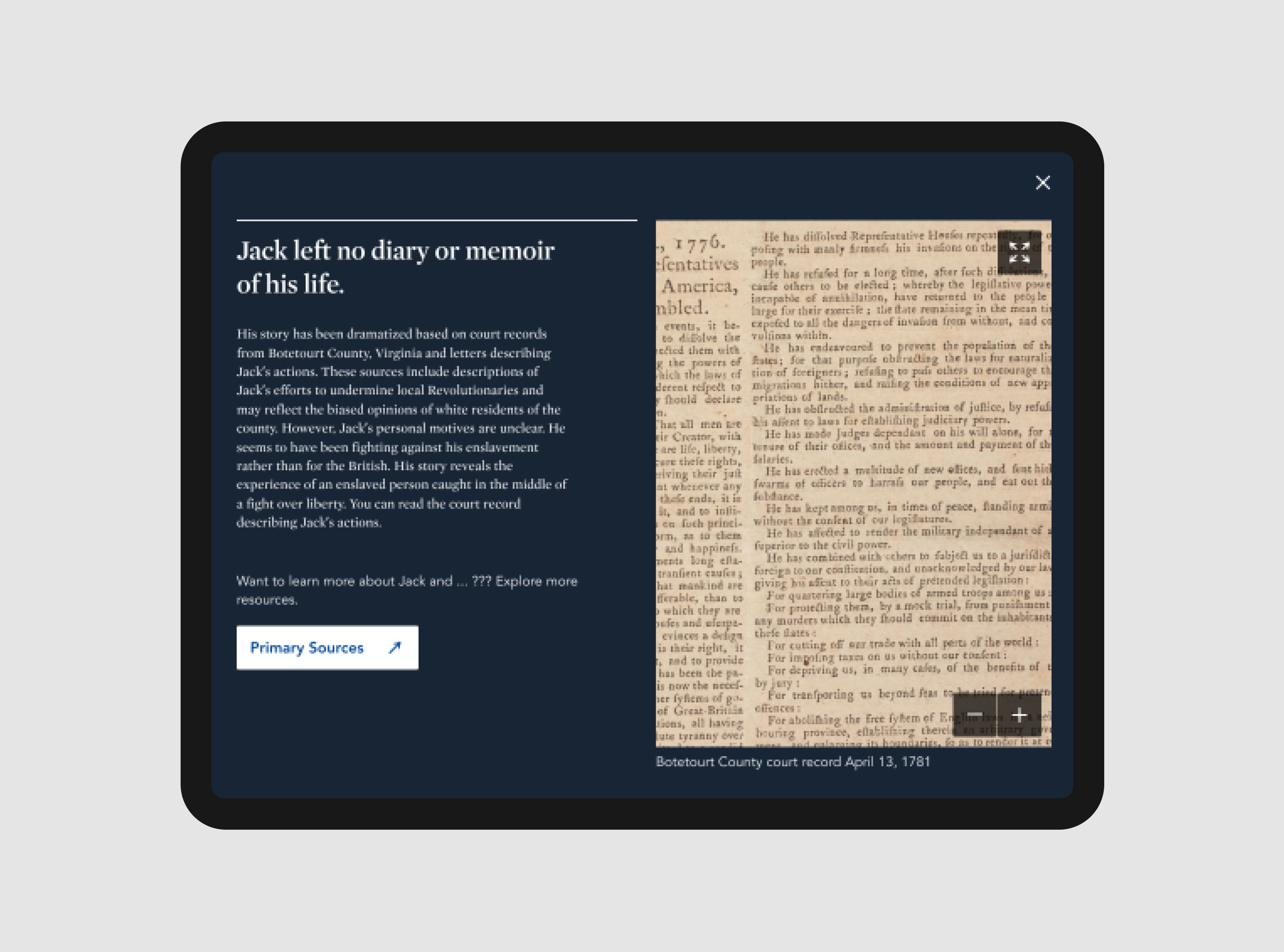
Finding Freedom is a series of interactive animations telling the largely untold stories of free and enslaved African Americans during the war.
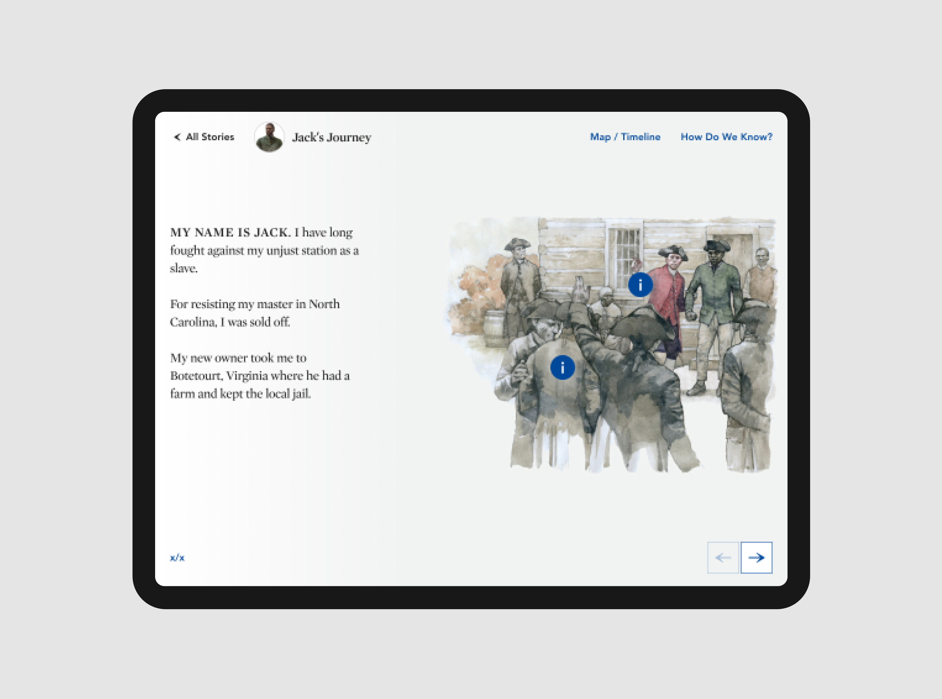
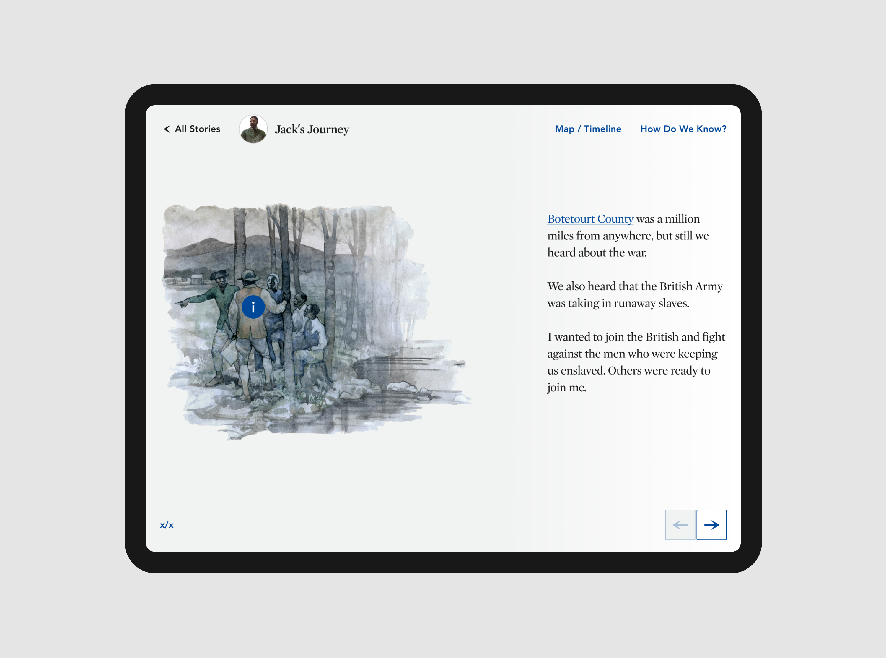
Finding Freedom draws from a variety of historical sources and contemporary analysis to try to understand the lives and decisions of five real people of African descent living in Virginia in 1781, as the British and American armies battle across the state. Their stories are told through research-based first-person narratives.


Additional Project Credits:
Tim Sullivan
Senior Designer, design system for Museum of the American Revolution’s primary website
Joy Ripart
UX Designer
Tim Sullivan
Senior Designer, design system for Museum of the American Revolution’s primary website
Joy Ripart
UX Designer